When you hear the term “neutral décor” do you envision a tan-on-tan-on-tan room? If so, you are in for a fun surprise. A space done in neutrals can be much more creative and exciting than just layers of solids so staid they’re almost asleep. The secret is to use a few unexpected neutrals: colors and patterns that play well in the sand box with everyone else yet are full of the kind of personality you need to give your home décor distinctive character.
My definition of a neutral goes far beyond the pale. To me, a neutral is any solid color, or a pattern that’s tone-on-tone or two colored, which looks good with just about everything. When customers at Nell Hill’s are shopping for upholstered furniture they want to have for years, I recommend they start with a palette of neutrals they won’t grow tired of and can easily update to keep their spaces fresh and interesting. Here are four of my favorite out-of-the-box neutrals that go with most décor and add some spice to a space.
Animal Prints
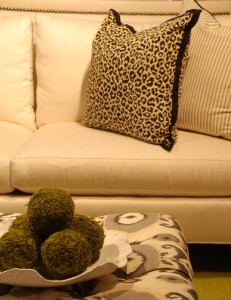
I know it may sound crazy, but I think of prints that replicate the coat patterns of wild animals, with all their power and energy, as neutrals. Especially when they are recreated in subtle color ways, like black and white or cream and tan. The lovely living room grouping above proves my point. This white sofa is given a B-12 shot with the addition of the black and white cheetah print pillow. (I really like the addition of the ticking pillow and the ikat ottoman, don’t you? Each of these pieces adds another interesting layer to our classic color palette of black and white.) Even though the animal print pattern is highly defined, it looks wonderful paired with lots and lots of different colors and patterns.
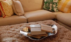
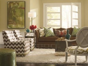
I am a huge fan of zebra prints done in soft, subtle color ways like tan and cream. I’ve used them in my own home and recommend them over and over again to my customers because the pattern is visually intriguing, but also soft and soothing. One of my favorite ways to use subtle animal prints is on coffee table ottomans, like you see in the photo above. The pattern is neutral enough you can pair it with lots of choices from the color wheel and it adds striking texture.
Stripes
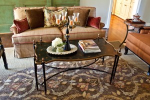
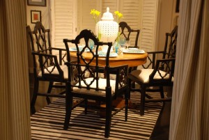
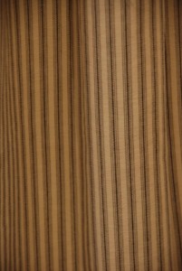
Whether they are subtle or strong, stripes are another unexpected neutral. Check out the bold rug under this darling dining grouping. It sets the tone for the space with its no-holds-barred graphic pattern. Yet, it’s a neutral because it goes with just about everything. Notice the fabulous drapes hanging on either side of the doorway? They are made out of ticking, another killer neutral!
I’m gaga over ticking and use it over and over again in my home. There is something so perfect about this petite stripe. From a distance it looks like a solid, but the closer you get, the more it comes alive. It never steals the attention yet it’s definitely not a wallflower.
Chevron stripes are electric, yet they, too, are a neutral in my book. Surprised? When I redecorated my guest bedroom, I had a pillow made out of a dark blue and light blue chevron stripe. When it’s tossed in with the bedding ensemble, it feels like a solid, blending in perfectly with the mix of colors and patterns in a backup role.
Checks and Plaids
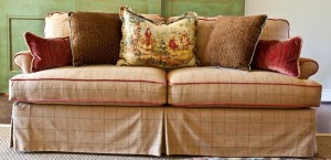
At Nell Hill’s, we cover lots and lots of sofas and chairs in plaid and check fabric because these amazing patterns deliver the best of both worlds: They are neutrals that give you a wonderful blank canvass to work with, yet they are intricate and intriguing enough to infuse the furniture with singular character. Windowpane plaids are sensational because the field is mostly solid, yet it’s broken up with a few threads in interesting colors you can bring out in your accent pillows.
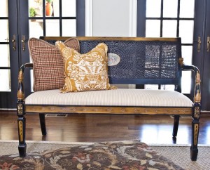
Like ticking, small hound’s tooth checks look solid from a distance, yet are full of intrigue when you see them up close. You can toss even the boldest pillows, like paisleys and toiles, on chairs like these.
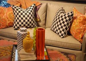
Ratchet up the scale of the check, and the room gets more and more fun. Still a neutral, with its two-toned palette, this peppy hound’s tooth check pillow helps take this sofa from placid to exciting.
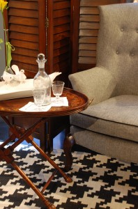
We have some of the coolest area rugs at Nell Hill’s right now that feature traditional fabric patterns enlarged on a grander scale. Every time I see this audacious hound’s tooth rug, I just have to smile. Look what it does to this very traditional setting of table and chair. In an instant, it goes from Masterpiece Theater to edgy transitional. Love it!
Strong solids
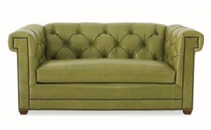
None of us have any trouble thinking of solids as neutrals. But what about when the solids are super bright or bold – do those qualify? If they look great with lots of other colors and patterns, you bet! Navy is one of my favorite solid neutrals. I can’t seem to get enough of this color, and through the years I’ve paired it with white, apple green, orange and coral. Now, I’m loving it with red. Teal is another solid that is stealing my heart because it seems to bring out the best in every color and pattern I toss at it, plus it’s just so darn fun all by itself.
Look out your window and you will see one of Mother Nature’s favorite neutrals: green. And that crazy girl mixes every shade of green together willy-nilly to create a palette that is vibrant and refreshing. When Pantone picked emerald as the color of the year, I let out a cheer. Shuttered Window, one of the newer tones in my Mary Carol Artisan Paints line, is an exquisite emerald and we have had loads of fun matching it up with a rainbow of colors, from dark gray to bright orange.
Next Week … I adore leather furniture. It’s sexy and sleek and classically beautiful. I’ll share some tips for weaving a bit of leather into your décor.

