If you asked me to pick my favorite shade of green for decorating, I’d say, “All of them!” When it comes to working with Mother Nature’s favorite color, every tone and tint is a winner. Green can be the main event in a room, shaking it to its core with over-the-top drama, or it can be a soft whisper, providing the background that allows other features in the room to shine. Here are three ways I like to use green when I design interior spaces.
1. Make a Big Statement with Saturated Green
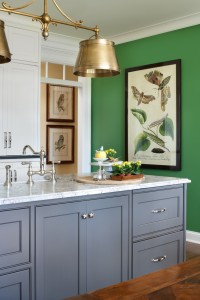
How about a room saturated in green? If you are as passionate about this color as a lot of our customers, you’re saying, “Bring it on!” Start by painting the walls a go-with-everything shade, like Shutter Window, the popular emerald tone from my Mary Carol Artisan Paints line (pictured above). This verdant color, and most other greens, looks amazing with just about any color you put with it so is a great choice if you want a deep, rich wall color.
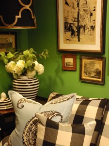
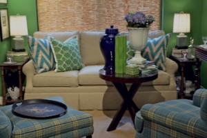
If you opt for green walls, like we did in the Nell Hill’s gallery pictured above, you can take the green theme a step farther by bringing in upholstered pieces that feature different shades of greens. But be sure to also weave in lots of contrast colors, or your room will feel like a leaf cocoon. For an equally powerful effect, paint your walls a neutral, like white, then pick upholstered pieces that include a mix of strong greens.
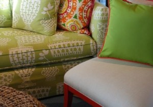
One of my favorite techniques is to pick neutral upholstered furniture and zip it up with pillows that include radiant greens. I love the look of the grouping above from Nell Hill’s. The patterned green sofa is energetic but not over the top, leaving room for this fabulously fun chair and pillow.
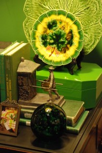
If you like where your green room is going and still want more, bring on the green accents. The Great and Mighty Wizard of Oz would approve of this little tabletop tableau at Nell Hill’s, and so do I!
2. Grab Attention with Powerful Pops of Green
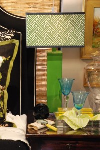
If you don’t want your interior spaces to take themselves too seriously, add a few playful pops of green. Green ceramic lamps topped with interesting lamp shades are head-turners. And they allow you to get a shot of bold color into a room without the risk of it taking over.
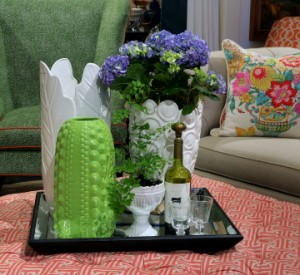
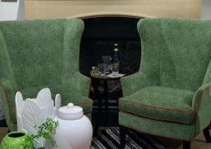
I adore decorating with timeless neutrals, like these white ceramic pots. But sometimes you just have to have some fun in life, and this unusual green vase does just the trick. Are there spots you can add a pot or vase in a shade of green you love? Using a few bold accents, like pottery, is an easy and inexpensive way to thread a bit of green into your décor.
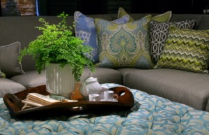
I’m crazy about this concert of pillows. And the bright green fabrics make the look. Another easy way to work green into your home? Potted plants, real or faux.
If you want to include some strong color in your décor but don’t want to fill the room with the same hue, upholster a chair or two in the feature color. It will become the focal point for the room but still allow you plenty of freedom to take the space in different directions.
3. Use Green in a Support Role
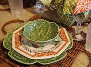
When you think about your garden, green provides the supporting role that allows the flowers to shine. Even though it’s a strong color, it has no trouble dropping into the background. Green accent dishes, like these great majolica pieces, provide some color and texture to your tabletop but still allow the pretty china pieces to get the glory.
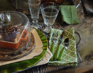
Experiment with different ways to add a shake of green to your table, like this green handled flatware, or napkins. I adore green goblets, too.
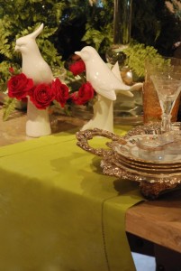
This green table runner acts as a beautiful base to a table setting. It’s a soft enough tone that you could go a lot of different directions with your dishes, from modern white to vintage floral to a geometric pattern.
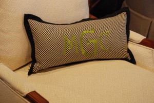
In my own home, I’ve added tiny pops of bright apple green to my living room furnishings, subtle touches like a green monogram or welt on a pillow, or a green flange on window coverings.
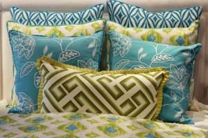
We love to use lots of shades of green in the bedding ensembles we create at Nell Hill’s. Green, blue and white is one of my favorite combinations.
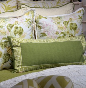
Green is the dominant color on this dreamy bed but it definitely doesn’t overpower, thanks to the heavy use of white and tiny touches of other tones brought in through these romantic floral pillows.
Next Week … Want to make your kitchen a visual treat? Focus on these five key spots.

