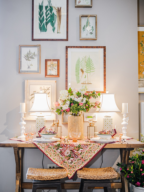
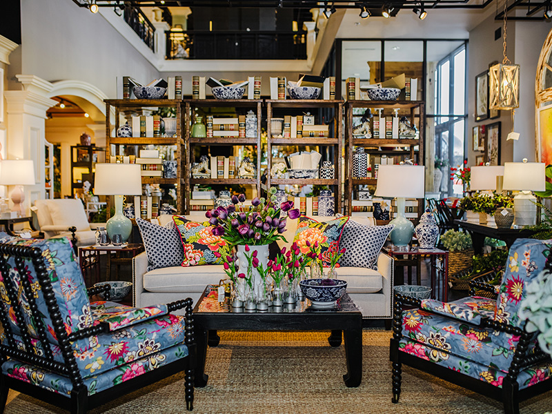
This time of year, with the first hints of warm breezes blowing through and a peek into the sunny days to come, never fails to put me in the mood to clean and modify my spaces. Everyone likes to talk about Spring Cleaning but what about Post-Winter Hibernation Refresh?! Indeed, this year more than ever it feels like I need to make a big change to welcome in a new season of my life. What better way than with a fresh coat of paint on the walls? Painting the interior of your home is a big undertaking and is certainly not without its challenges! Last month we took the leap and repainted our entryway at the shop and it has truly transformed the space. I knew I wanted to go in a new direction from our juicy and vibrant Hedge Apple green that had been featured for many years but wasn’t sure which color would be able to span the multiple rooms and looks that we have in that area of the shop. As soon as I saw a swatch of our new color, Atchison, I knew I had found the one.
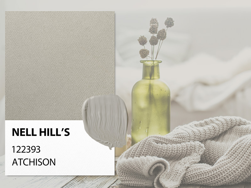
Atchison is a creamy, dreamy, earthy taupe that brings to mind clean and comforting spaces and makes me think of cozy nights spent with family and friends. This shade is one of pure comfort and home, so I thought there no better name than one that pays homage to our original home in Atchison, KS. It is one of the three essential neutrals found in our Nell Hill’s paint line along with our medium shade Northland Greige and lightest shade Hawthorne Blossom, a warm white. Taupe is a wonderful paint color because it provides the best of all worlds. It brings a warmth to a space that is hard to achieve with stark white while remaining the perfect backdrop for any accent color palette from pastels to jewel tones to even more neutral hues. Atchison has a depth to it that is enveloping, soothing and oh-so-charming, making it perfect for spaces where you want to create a welcome and cozy atmosphere.
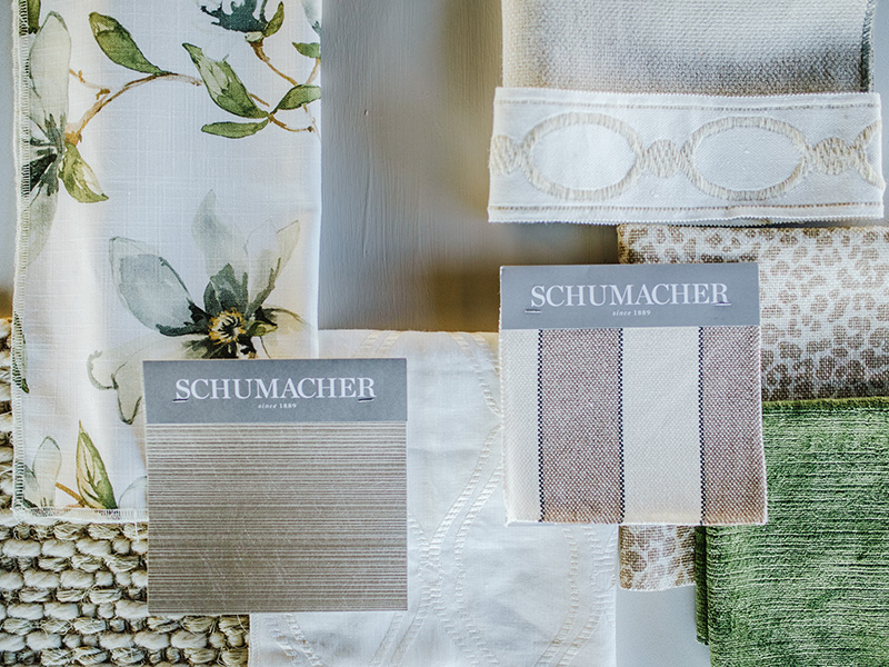
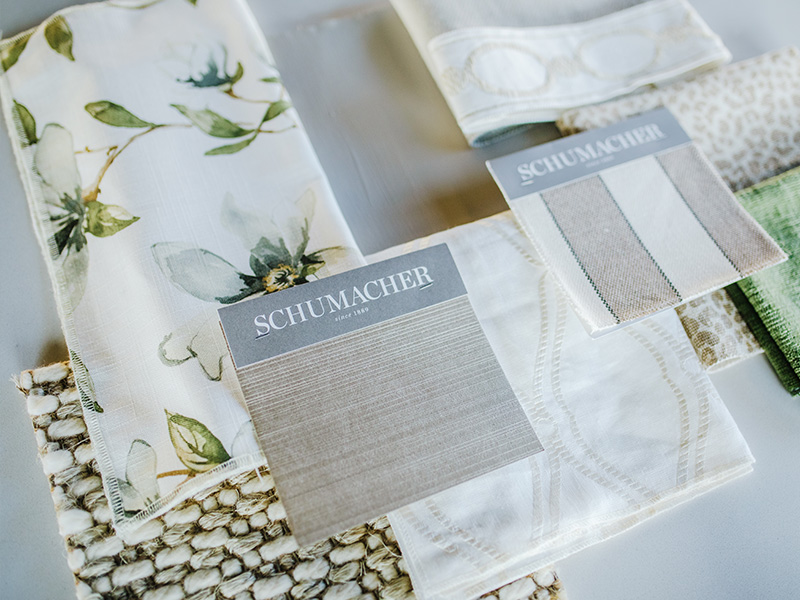
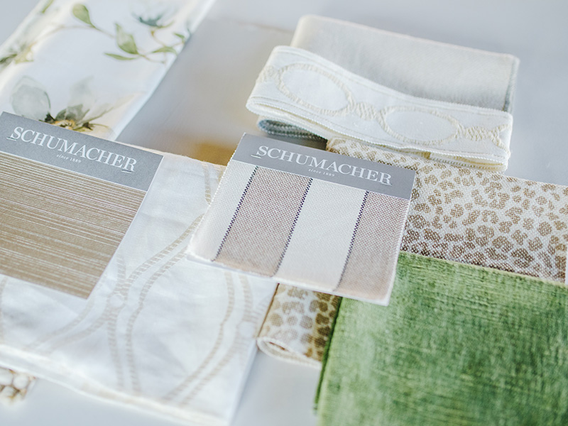
A few of our talented Nell Hill’s designers have found inspiration in our refreshed space and have pulled together some stunning fabric pairings that enhance this perfect taupe. Our first designer, Jenna, envisioned a light and airy living area that shows her love of using classic elements to create timeless living spaces. What I adore most about this simple color palette is her gorgeous use of texture. From the oversized weave of the natural fiber rug and the ridged shine of the Schumacher accent wallpaper to the smallest finishing touch of embroidered trim perfect for a sofa skirt that flows effortlessly into her pearl-on-white window covering textile, each detail brings interest and energy to her room. The fern coloring of her chosen velvet fabric is perfect for a show-stopping ottoman and showcases one of my favorite new Nell Hill’s stock floral fabrics at the same time. This crisp look is perfect for a room with lots of natural light peeking in through the curtains.
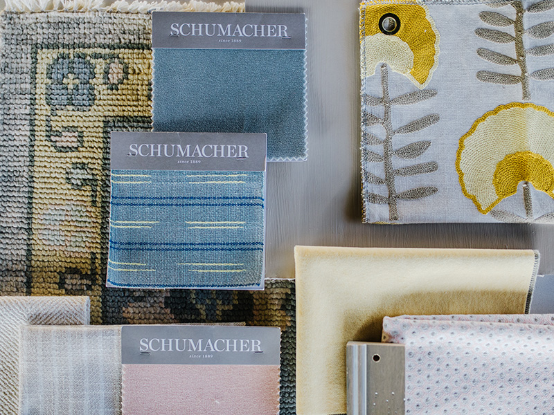
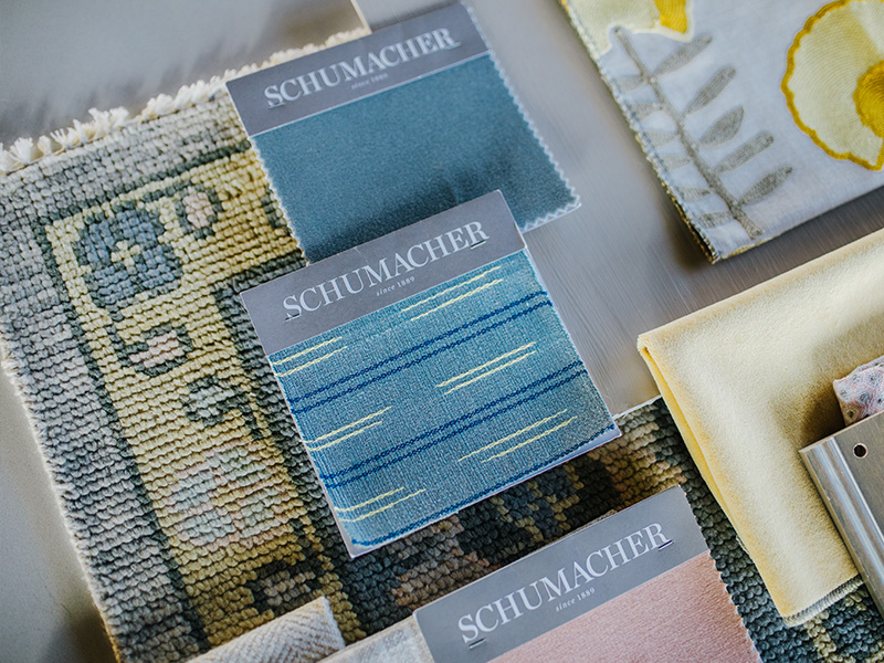
For our second featured look, our team member Dallas was inspired to create a nursery palette in honor of her dear friend who is currently a mommy-to-be. More and more baby and kid rooms are turning to neutral wall colors that allow children to grow into their own style easily and without yearly fuss over a new favorite color of the week. Since Dallas loves to incorporate color into her designs, she decided on a look that was bright, energetic and most of all fun! A playful rug is the perfect starting point to introduce pastel shades of yellow, blue and pink into this room. Atchison is a wonderful color to pair with soft shades as it truly lets them shine on their own. By mixing in a balance of plush velvets and linens with boldly textured embroidery and tweed accents, this pairing achieves the difficult task of being both subtle and bold.

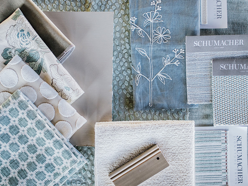
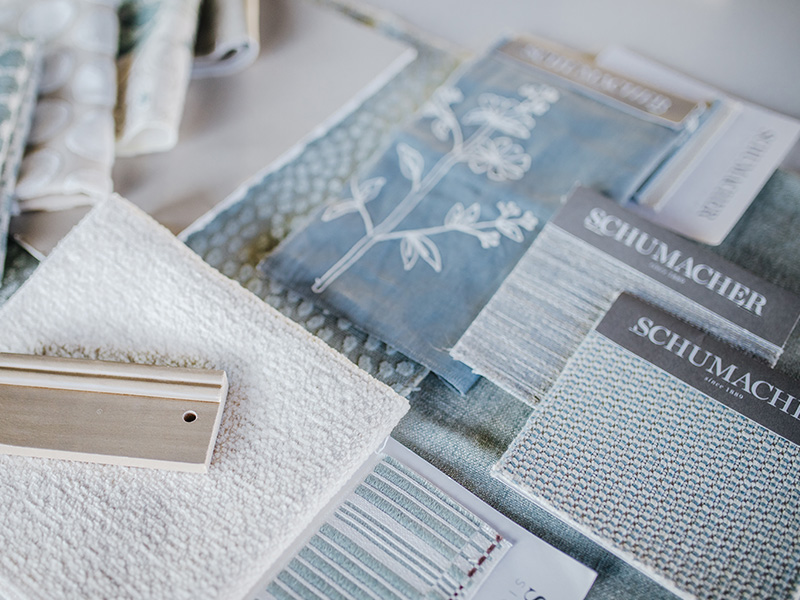
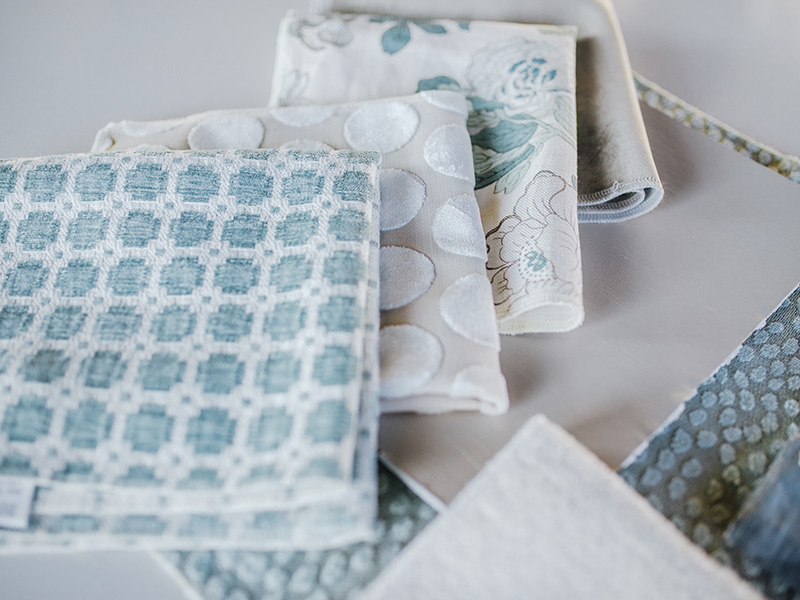
Our final favorite look from Ellen incorporates one of our go-to color pairings for taupe, which is a complementary shade of blue. Since our Atchison color has warm undertones, blue is the perfect balancing color and truly pops against this marvelous taupe. In fact, looking at this pattern mix has me thinking about redoing my bedroom here and now! One of Ellen’s talents is her ability to marry the old with the new as well as excelling in pairing trendy neutrals with muted colors, so this pretty pairing comes as little surprise to me. Mixing traditional floral prints and simple embroidery with both youthful over-sized polka dots and modern irregular velvet dots is a risk well worth taking. The muted blue and matching tones of her chosen color allow for more room to play with a variety of textures and patterns without overwhelming the or downplaying the chosen paint color. This mix creates countless ways to arrange a soothing and relaxing bedroom interior.
I am so in love with our new entryway! I know I won’t be able to stop bringing these new colors into the shop this year. The only question is what will be next? Perhaps a grey-toned pink like Prairie Rose, or a vibrant statement like our Ward Parkway Brick? Check out our line of colors online and let me know what you would like to see featured next in the comments! Until next time – happy decorating!
