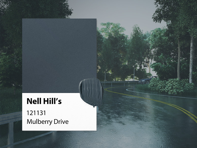
As you change, grow and evolve throughout time, so does your home. New additions are brought in, furniture changes, art is moved, and your personal style becomes more and more pronounced. When I was searching for the perfect additions to our Nell Hill’s paint line. I knew I wanted to find colors that were not only complex and intriguing but also hues that could adapt to the natural changes in a home. A great example of a multifaceted shade is the dark, moody Mulberry Drive. This deep teal tint when viewed in different lights and settings can bring to mind a winding road after a summer storm, or the rich dusty skin of a bursting blueberry. I just used this color in my first floor powder room and I fell in love with it so much that it may have to travel to our family room as well!
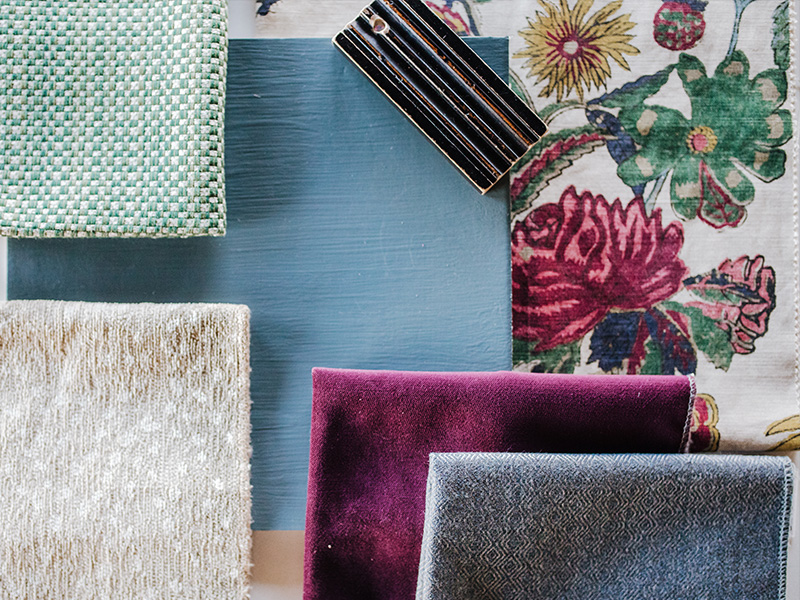
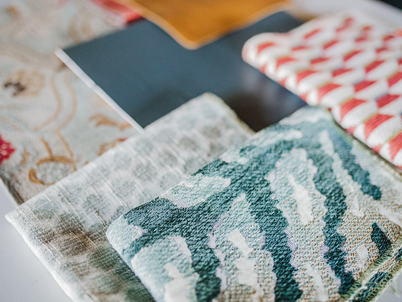
Of course, we can’t show off our paint color without pairing it with some fabulous fabrics from the shop! I wanted this first look to have a great balance of values, pairing Mulberry Drive with some darker, cooler colors with lighter neutrals. I started with Thibaut’s Coromandel Jewel fabric that matches the Mulberry shade of moody blue beautifully. I love how this textile brings in a variety of cool tones for us to build on. We mixed in the lovely Sassy Berry violet velvet to add a touch of lux and our Carmine Palm woven cotton blend for an earthy texture. The look is rounded out with a softly patterned navy and our fan favorite antelope print that goes with just about anything!
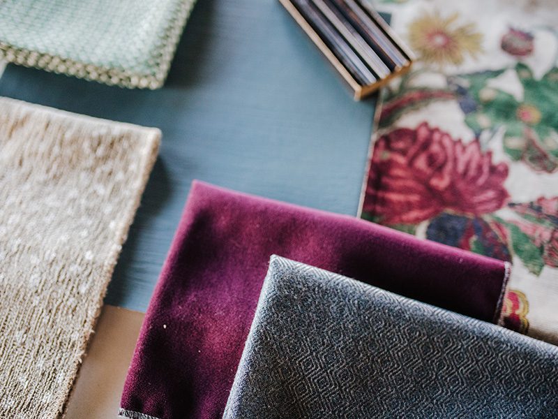
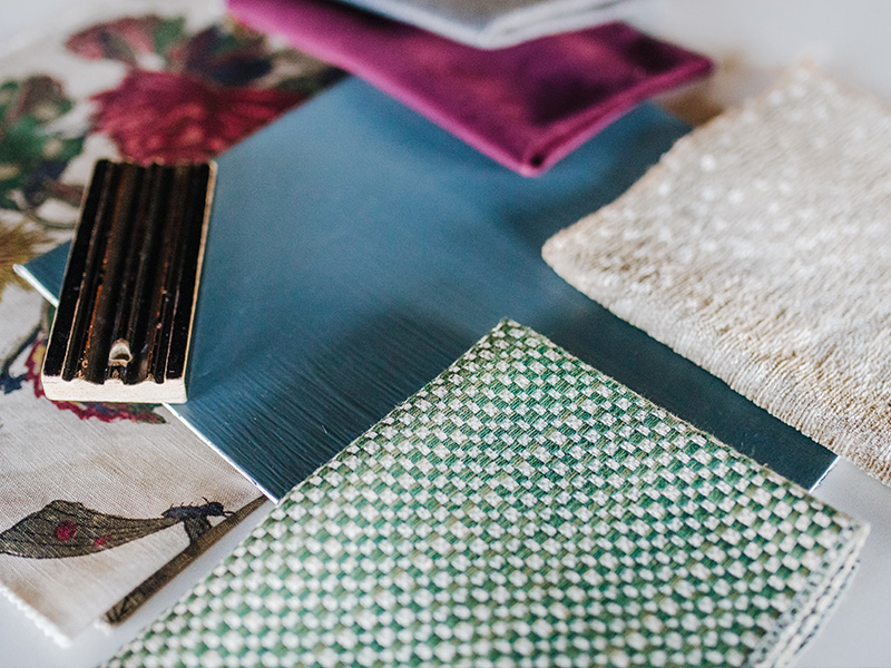
Our second look is a bit outside of our normal style box! It’s not every day that we pull some magenta leather into a presentation! I wanted to show you that Mulberry Drive can hold its own when paired with a variety of colors, even saturated, vibrant brights. Here, the coolness of Mulberry Drive is warmed up with some rich plums and purples and a touch of red. The pop of turquoise in the Sri Lanka Embroidery fabric keeps things lively and brings everything together.
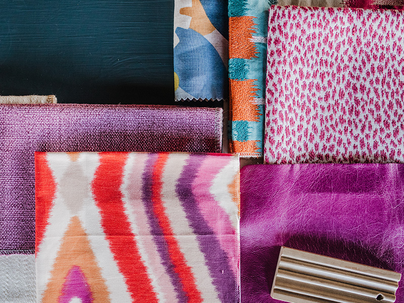
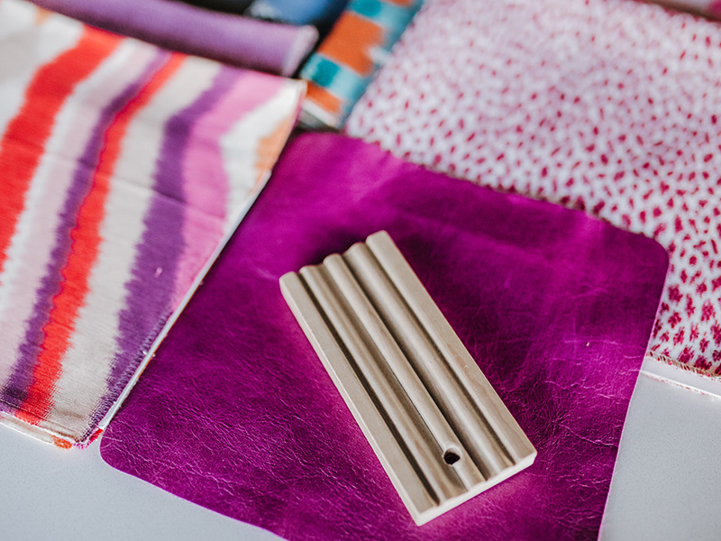
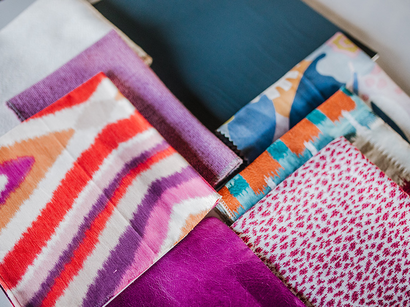
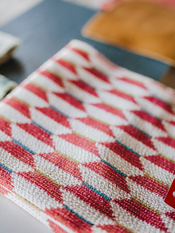
Rounding out our groupings is a third look that mixes both warm and cool tones to create an eye-catching yet comfortable setting. Just because this paint color can withstand a whirlwind of color and pattern doesn’t mean it has to! Sometimes it is nice to let the paint shine and complement it with other shades of blue. Add in a pop of warm leather and coral accents for a little excitement and you have a combination perfect for a living room or bedroom!
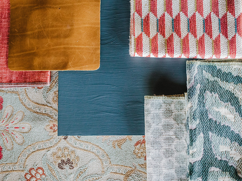
I love to experiment with wall colors and can’t wait to be able to show you this wonderful color in my own home as well as the shop! This particular jewel tone teal-blue was inspired by our previous paint color, Commercial Street. I wanted to update the color with undertones that would allow it to be incorporated into rooms for many more years to come. If you are here in Kansas City, be sure to swing by to visit us on Mulberry Drive and see this color for yourself next year! Until next time – happy decorating!
