“You can’t depend on your eyes when your imagination is out of focus.” These brilliant words by Mark Twain kicked off a Pantone Color Seminar that Mary Carol and I attended at Atlanta Market in January. Mary Carol looked over at me, raised her eyebrows and smiled. We were off to a good start!
We are amazed by color. It helps us regulate our feelings. It can shape our perceptions. One of my favorite things about Nell Hill’s is that I get to watch people welcome color and texture into their homes. It can mean the difference between a stark clinical space and a warm inviting one. Color is everywhere. It’s embedded in every new design. But how we choose to use it is our true super power!
In this increasingly digital world we are bombarded with color on our phones, televisions and computer screens. It is easier than ever to feel disconnected to the colors we see in real life. I see a nation-wide pull to all-white-everything in our décor and in our kitchens. (For the record – my kitchen cabinets are currently white.) While I do appreciate the aesthetic, I believe magical things happen when we celebrate with sumptuous colors inside our homes.
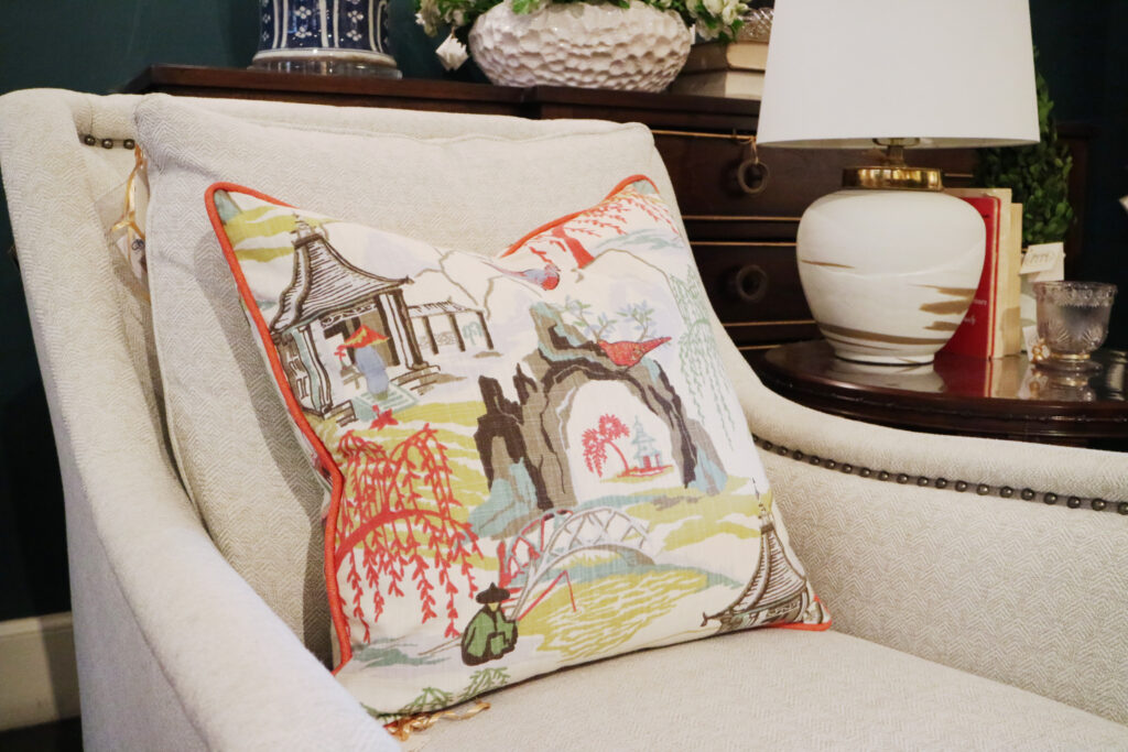
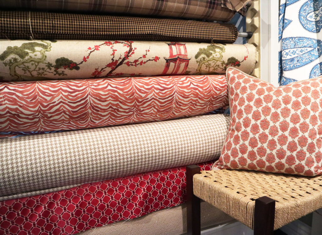
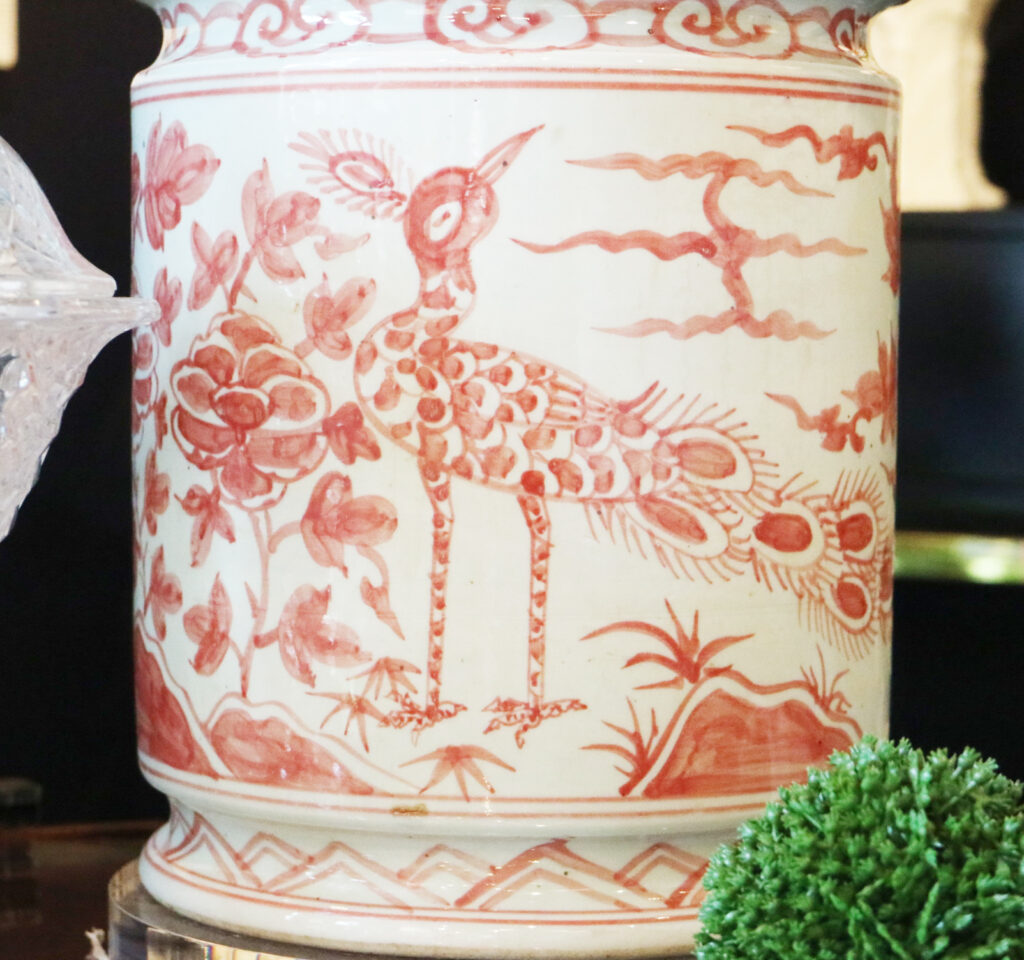
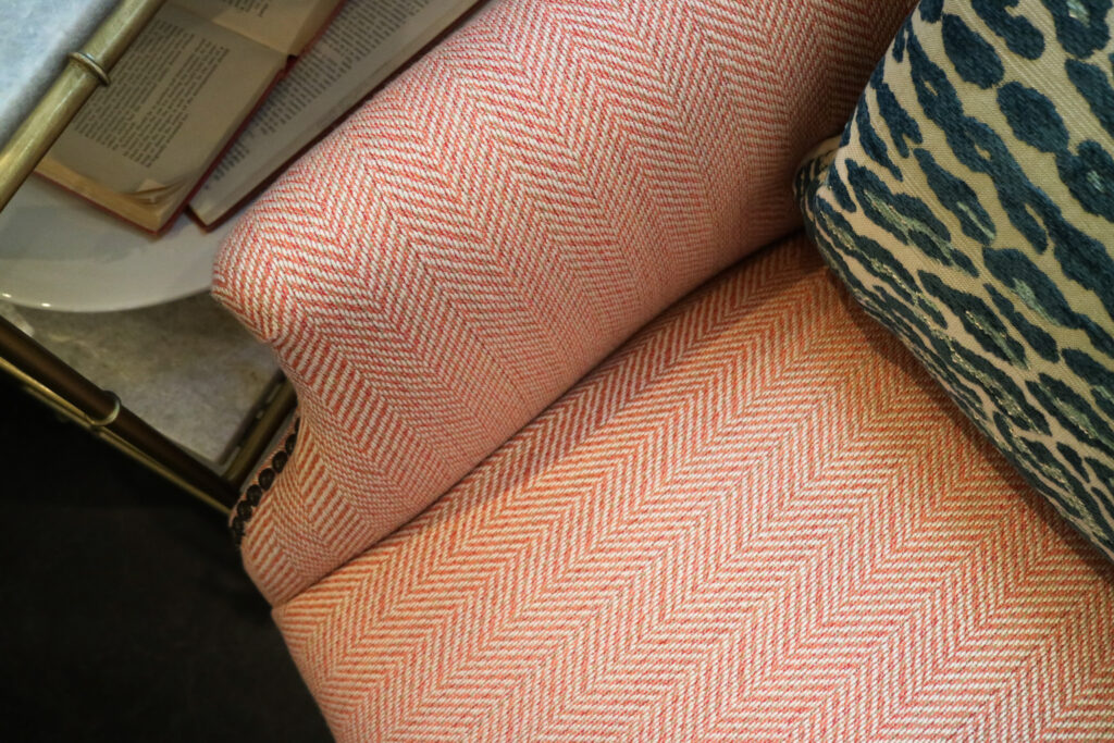
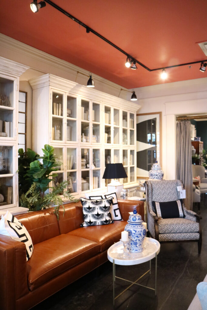
The Pantone color of the year, Living Coral, is enchanting and complex. It was chosen by the Pantone Color Institute for its duality, and for its ability to live both digitally and in the real world. Thankfully so! It’s the perfect color to help us shake off the cold dreariness of our midwestern winters! Living Coral is bold and vibrant enough to stand on its own, but soft enough to work as an accent color in the right space. The color coral is near and dear to my heart. The ceiling in the shop’s main living area is done in this pretty hue!
When asked “Why now?” for the Living Coral selection during the seminar, the answer was simple. I never would have thought of it on my own: Connection! Living Coral evokes a connection with the natural world. (Cue a lightbulb moment for this girl!) Mary Carol and I looked at each other and giggled. I’m glad it wasn’t obvious to her either. Like fish connected to coral reefs around them, Living Coral is our invitation to reconnect with the real world once again and enjoy the breathtaking colors in nature!
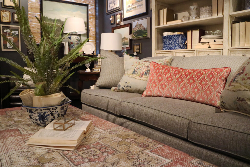
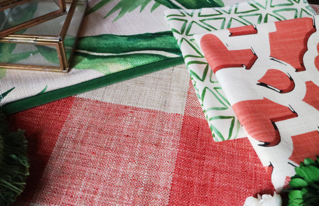
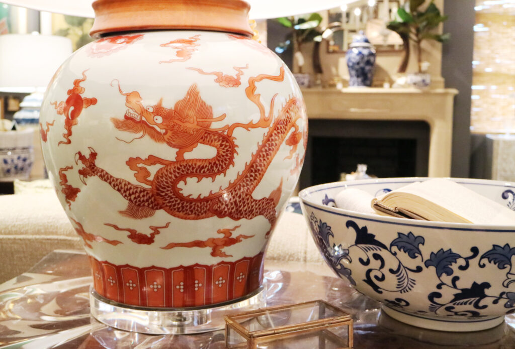
To use Living Coral in a room, I like to pair it with deep green hues and organic shapes and finishes. It works equally well with luxe finishes like gold, silver and oxidized metals. Want to bring it to center stage? Pair it with light muted tones like powder blue or warm taupe.
Mary Carol and I left the color seminar feeling refreshed and invigorated. Was it because we could now rest our tired feet after a long day at market? Or was it the new energy of Living Coral? If I have to guess, it was a little bit of both.
You can expect to see coral pop up in home furnishings and décor stores across the country. You can also expect to welcome Living Coral into your wardrobe, and even into your tech! What’s old is new again as retro colors like Living Coral get a modern update across the board. Do you have any Living Coral or other coral tints and shades in your home? I’d love to see how you incorporate it!
