Our Favorite Spring Color Palettes
Now that it’s starting to feel like spring outside (well…kind of…random snowstorms aside) – where you can leave the house without a jacket and the trees look like they’re thinking about blooming – the weather is finally catching up to the spring that’s been living in the shop for months! We’ve had color popping up in every corner since January but there’s something especially satisfying about the moment the outside world starts to match the mood indoors. Suddenly the sunlight feels brighter, the rooms feel lighter, and all those palettes we’ve been playing with seem perfect for the season. They’re the colors that make a room feel fresh, so let’s dive into a few of our favorite spring color combinations around the shop.
Blues & Greens: Spring’s Most Reliable Duo
There’s something about blue and green together that just feels like a deep cleansing breath. Maybe it’s because the pairing shows up everywhere in nature (a nod to our last blog post 😉) or maybe it’s because it is the palette we return to again and again when we want a room to feel calm yet alive!
This color palette is sprinkled around the shop from little moments between a chair and pillow to bedding and full room décor. It’s the kind of palette that never tries too hard and that’s exactly why it works!


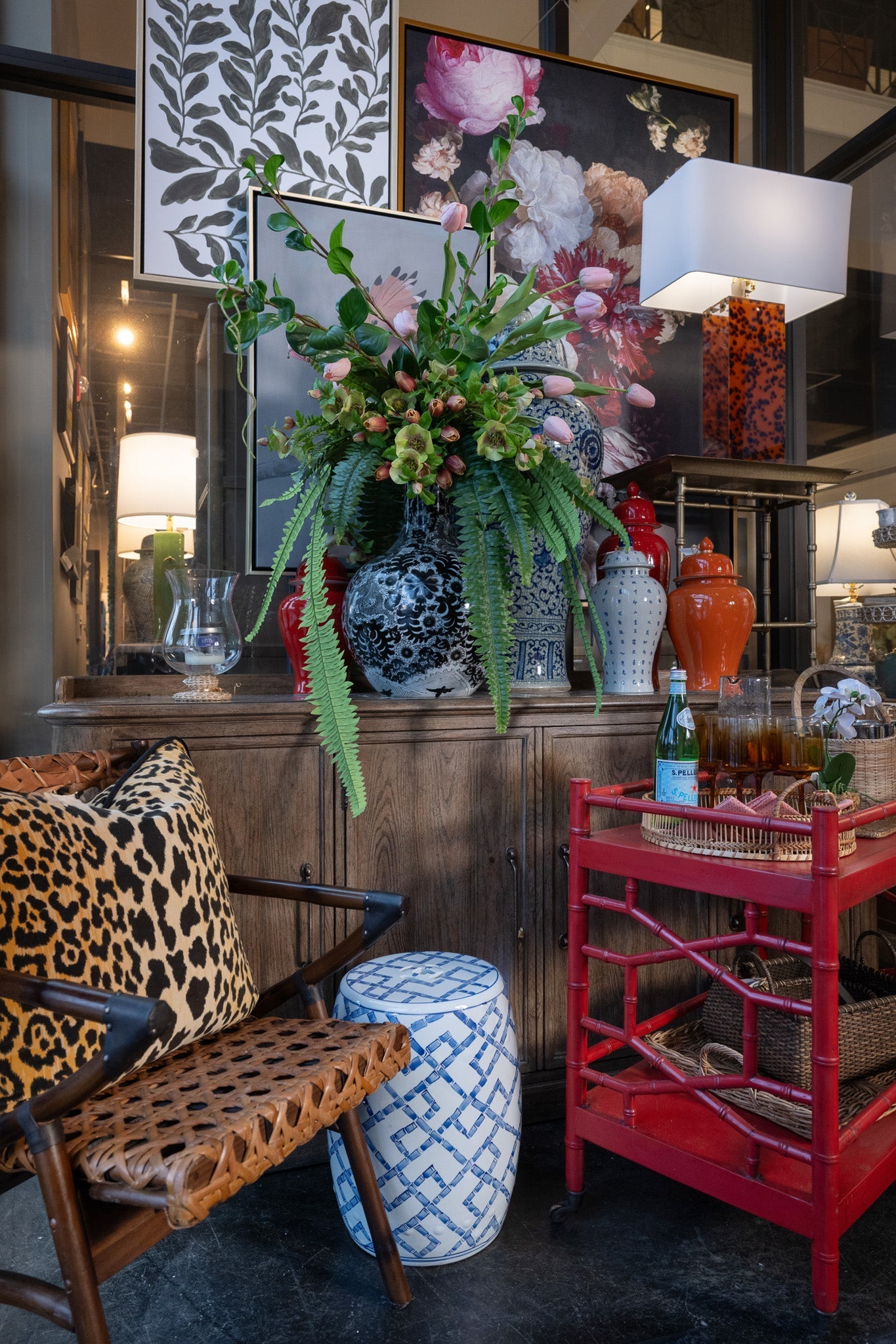
Neutrals & Green: Fresh and Sophisticated
For those of you who are less into bursts of color, sometimes the most refreshing thing you can do is soften a room instead of brightening it. That’s where mixing neutrals and greens can feel sophisticated, soft, yet still fresh. Warm wood tones, woven textures, creamy upholstery, and then just the right touch of green — a patterned pillow, a leafy arrangement, a botanical print tucked into a cabinet. It is a palette that makes a room feel grounded, organic, and effortlessly pulled together.


Yellow & Blue: Timeless Charm
Every spring, without fail, yellow sneaks its way back into the shop. It brightens a room instantly and brings a youthful energy – and yes, for some people it can be a little much. And for that reason, I love pairing it with blue. The moment the two come together, yellows feel grounded, classic, and refined.
A few sweet moments around the shop are especially leaning into this palette, and if you remember from a few weeks ago, Dianne was working on a project built entirely around this combination. There’s something about the contrast between the two colors that create a look that’s both happy and timeless. It lifts the mood of a room and brings an effortless charm that feels just right for spring!


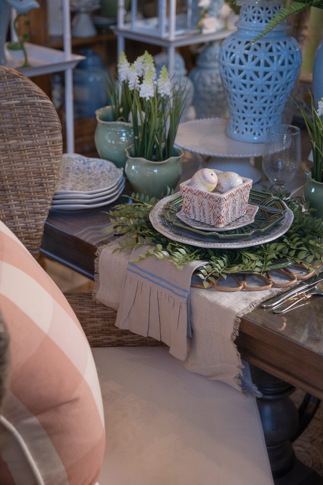
Soft Blues with Pops of Color: A Canvas for Your Personality
Soft blues can be found in the shop year‑round and have practically become a neutral for us. They’re calm, comforting, and endlessly easy to build a room around. But as we do, we’re having a little fun and giving that softness a pop this spring. Pale blues make the perfect backdrop for exciting patterns and playful color moments — whether it’s a floral arrangement perched on a table, a patterned pillow that pulls in unexpected hues, or a piece of artwork that suddenly feels brighter.
It’s a palette that’s light and airy but leaves plenty of room for personality. And one where little pops of color bring energy in an effortless way that feels just right for the season.


The best part about spring colors is that they’re easy to add into your space with a pillow, lamp, or tray. Color has a way of shifting the whole mood, even in small doses. As the shop fills with these palettes and spring unveils itself outside our doors, it feels like the perfect moment to bring a little of that same freshness and lightness into our homes. Until next time – Happy Decorating!