Want to chase away the winter glum by bringing some cheery color into you home? Have I got a dynamic duo for you: turquoise and coral. This peppy color combo adds vibrant energy to a space, whether you do it up loud and proud by washing your room in saturated shades, or just adding a few subtle touches here and there to spark up neutral spaces. Here’s some inspiration to get your started:
First, Find Your Color Sweet Spot
This season a lot of designers are showing snowy white interiors. I love pristine white washed spaces. But right now at Nell Hill’s, we’re all about zipping up that stark white world with some blasts of color. While I’m a big fan of statement colors, I think they have to be balanced with quiet neutrals, like white and cream. The goal is to have a room that’s cheery, but not jarring to your eye. As you design your spaces, you’ll find your own “sweet spot” where the balance is just right for your taste.
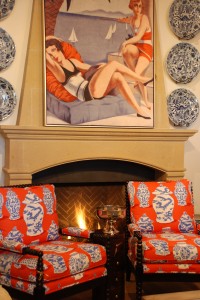
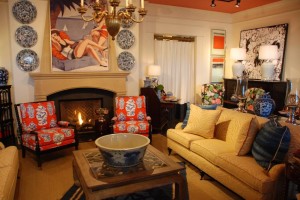
This photo is of our freshly redesigned front gallery at Nell Hill’s Briarcliff, where we played with color in a new way. We covered the walls in white then painted the ceiling coral. The furnishings bring in a mix of complementary tones, brought to life through a bouquet of patterns.
For the Love of Coral …
Coral is pulling the heart strings of the Nell Hill’s design team and our many customers. Orange has been a big hit for years, and is still showing strong. But for some folks, it’s just too intense. Coral is a gentler version of orange that is flattering in most interiors. It has the lovability of pink, a perennial favorite from our youth, but is a grown up, more sophisticated color. People are braver experimenting with coral than they are with other brights, and they are mixing it with a rainbow of tones, like chartreuse, apple green, cobalt blue. My favorite coral companion right now? Turquoise!
… and Turquoise
This lovely shade is one of those remarkable tones that seems so bold, yet actually plays as a neutral, the ideal mate for just about any other color you throw at it. Depending upon your style, you can pick turquoise fabrics and accents that are bright and crisp. Or, you can go for a softer and muted take, more vintage in its feel.
The Tango
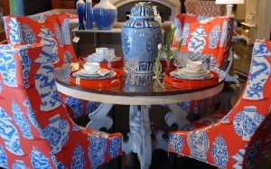
Turquoise and coral do a steamy dance together in this powerful dining group at Nell Hill’s Briarcliff. The upholstery fabric is balanced by the white table.
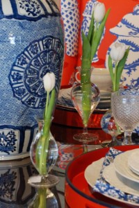
Our design team took the grouping to the next level by setting the table with coral and turquoise accents. I love how the pattern in the fabric is echoed in the blue and white jars in the centerpiece.
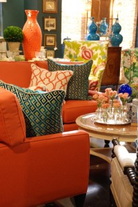
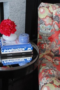
If bold furnishings aren’t for you, you can dust a space in softer hues of coral and turquoise, like this sweet tabletop display.
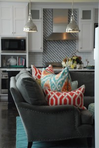
We had so much fun helping my friends Matt and Kristen decorate their home with coral and turquoise. In their kitchen, soothing white cabinets and a gray sofa provide the neutral base for zips of playful color, brought in with a few accent pillows. If you have neutral furnishings, simply changing out your pillows will transform the look of your room.
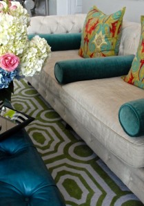
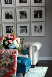
In their living room, the neutral walls and sofa are the quiet backdrop for the bright and beautiful turquoise ottoman and coral chair. The sofa sports coral and turquoise pillows to thread the color through the room’s design.
Next Week … Picking the right accent table for your spaces is trickier than you think. I’ll share a few tips to get just the right one.

