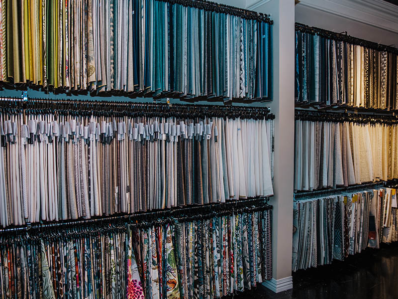
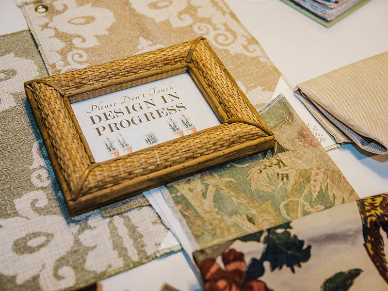
Over the last couple of months, I have been enjoying Fridays more and more. No, its not because it’s the weekend (although I do love the shop energy on weekends!) but because of all the fun we’ve been having with Fabric Fridays! My love of textiles inspired me to start sharing our most beloved, unique, and creative pairings of fabric each Friday on our social media pages (@nellhills). It’s clear that you’ve been loving them too – thank you for sharing in my adoration of patterns, colors, and textures! It is always a pleasure to offer inspirational pairings and to converse with fellow fabric fanatics. The response has been so nice that I wanted to do something extra special and dive deeper into a few of my favorite pretty pairings of the moment!
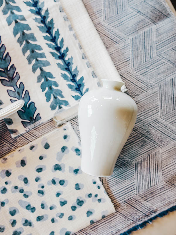
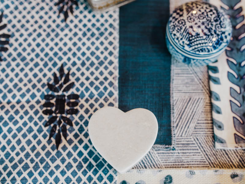
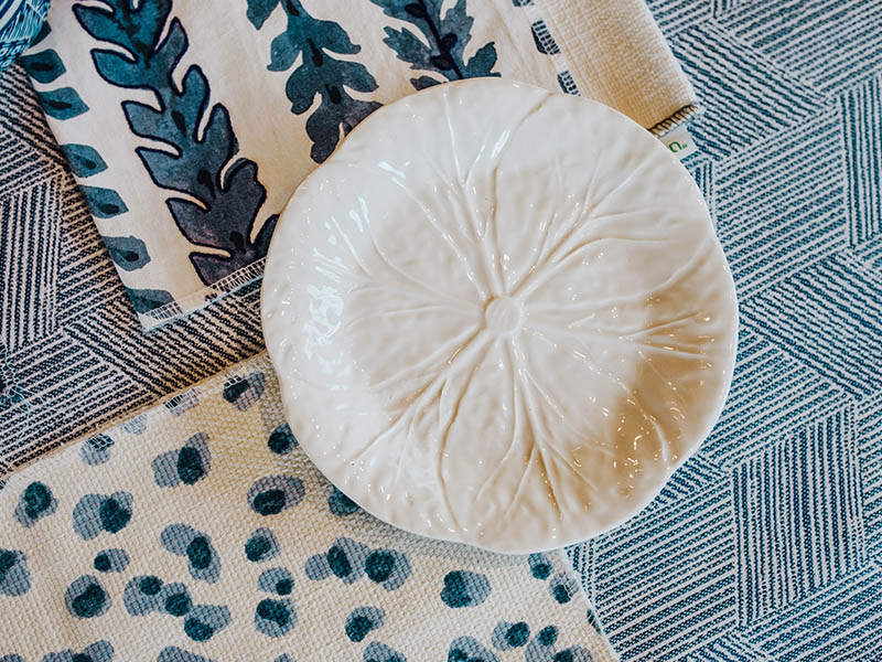
Blue Crush. Blue and white is a classic and timeless combination, but that doesn’t mean that there aren’t new patterns and textures to explore! These gorgeous hues of navy, baby blue and cerulean leave me feeling anything but blue. One of my favorite fabrics is the subtle and delicate geometrical denim. The pattern on this indoor/outdoor material adds dimension and depth, while still allowing it to be used as a solid would on larger spaces without overwhelming a room. Beyond that, it pairs nicely with a wide range of blue tints, textures, and patterns. When it comes to texture, I am head over heels for the intricacy and beauty of embroidery. The Morning Glory print that I have paired in this grouping makes for a stunning statement pillow that will pop against any competing patterns and plays nicely with the fun and more modern Snow Leopard spotted cream and blue, as well as the elegant blue damask. This is a fabric combination that can be used throughout your home, but I love it in a bedroom setting. The patterns work so well together that you can mix and match your duvet fabric with fun accent pillows for a fresh look whenever you desire!
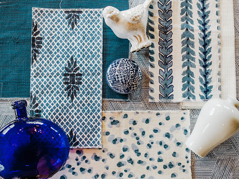
Geometric Pattern -Morning Glory ($47.25) , Embroidered Decorative Stripe – Sela Denim ($24.75), Snow Leopard ($29.50), Solid Navy – Cliffdale Navy NH ($33.75) Damask – Boca Wedgewood NH ($24.25)
Call shop for more info and to order
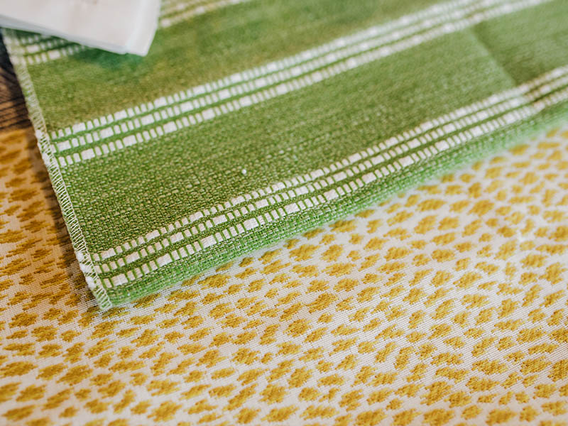
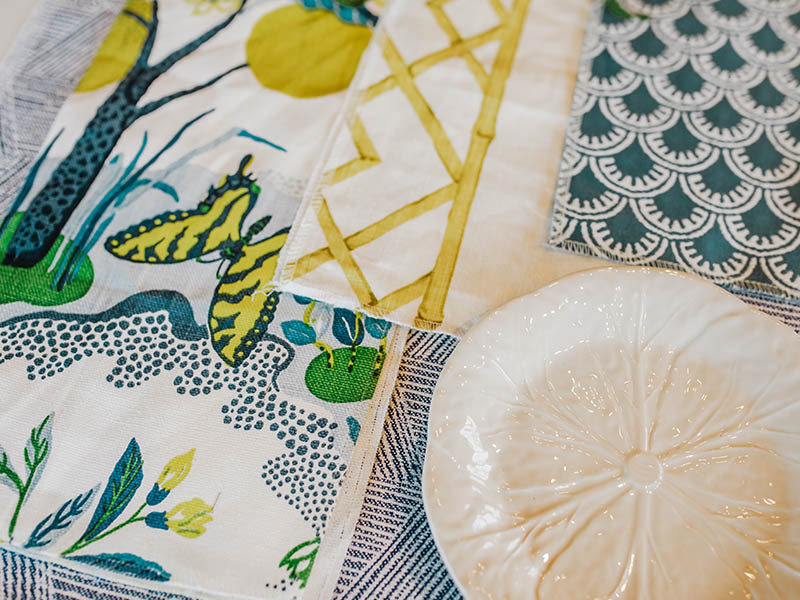
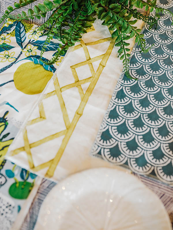
Feeling Zesty. Searching for something bright and full of energy? Look no further than this patterned palette full of sunny yellows, fresh green, and dreamy turquoise. Introducing a warm pop of color into a cool color motif adds a spark that will put a smile on your face whenever you enter the room. My mind instantly takes me to a lovely sunroom where this fabric would truly shine (especially since many of these featured finds are performance fabrics). The lovely navy Thibaut Maisie fabric and as well as the green striped Thibaut Boardwalk Leaf designs are perfect for cushions and would shine against wicker, wood, or any outdoor furniture base. In the warmer months, the Citrus Garden indoor/outdoor fabric by Schumacher and Citron Bamboo pattern are the perfect decorative pillows to pull these hues together in a stunning display of butterflies, lemons and florals. When the seasons change, so can your accent pillows and throws. A deep mustard hue in place of the Citrus Garden will have fall and winter feeling just as fresh as those sunny days of summer.
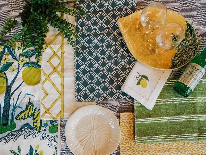
Yellow Bamboo -Celosia Citron ($42.75), Blue Fan fabric -Maisie Navy ($102.40), Multi colored floral – Citrus Garden Pool ($337.30), Green stripe – Boardwalk Leaf ($129.60), Yellow Spotted – Citra Yellow ($141)
Call shop for more info and to order
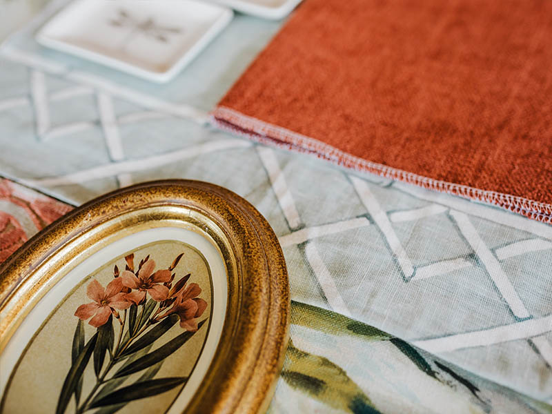
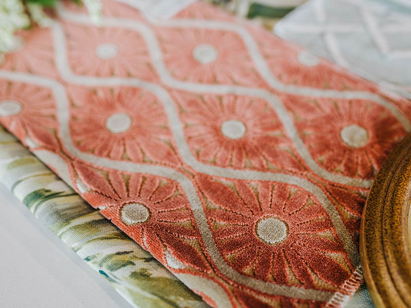
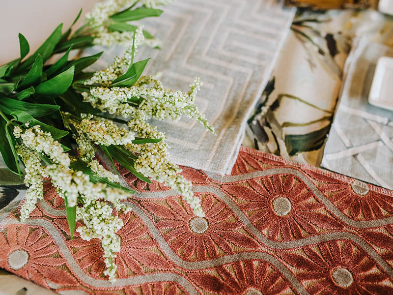
Coral Garden. This combination is truly one of my year-round favorites and is usually featured somewhere in the shop (usually in a sitting room or dining room setup)! With its burnt coral tones, pale sea foam blues, and dreamy creams it feels like a soft and sophisticated spin on red, white, and blue. The floral cut velvet gives this pairing a lux feel that can easily mix with linens to create a natural or more “earthy” juxtaposition that is stunning to look at and not at all pretentious. Adding in a bit of warm leather and dark wooden pieces is a great option to bring out the richness of the fabrics. The bamboo pattern found on the Celosia Aquamarine material and fern details of the Heavenly Seagrass textiles play beautifully into the balance of luxury and down-home comfort.
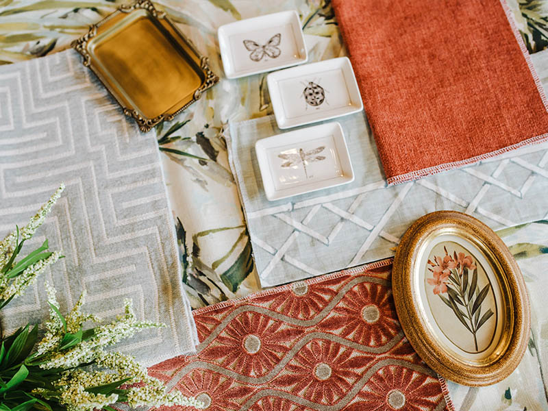
Background fabric w/ ferns – Heavenly Seagrass ($24), Greek Key -Puzzle Seafoam ($22), Bamboo Pattern – Celosia Aquamarine ($42.75) Floral Cut Velvet – Claudia Henna ($64) Solid Coral – Silex Blossom ($24.75)
Call shop for more info and to order
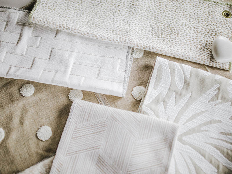
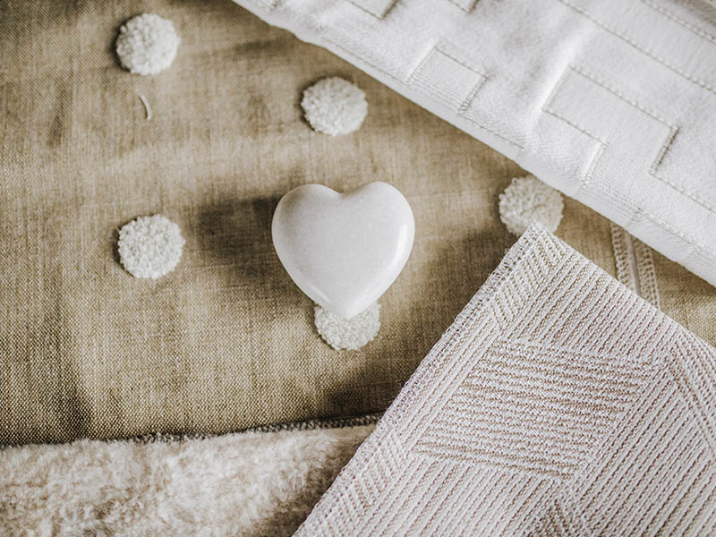
Textured Neutrals. I keep seeing and hearing that brown is the “new grey” among designers and home décor enthusiasts, which is perfect, I’ve always loved warm neutrals! You can’t go wrong with a neutral palette. A mix of muted colors let the textures of the fabric shine and become the star of the room. When you highlight textures like these, they add a measure of soft comfort to a space. While this look was originally inspired by a nursery (perfect for Jack or Jill), I love it in any room. The best thing about this mix is the versatility of tans, whites, creams and beiges. By switching out a few choice accents (such as lamps, artwork, throws and decorative pillows) as your child grows, the room can grow with her or him. The same goes when using a palette like this in your own room – our adult tastes can change just as quickly! Invest in long-lasting big pieces like window treatments, sofas and swivel chairs in neutral hues that can be integrated into exciting new designs as your style evolves.
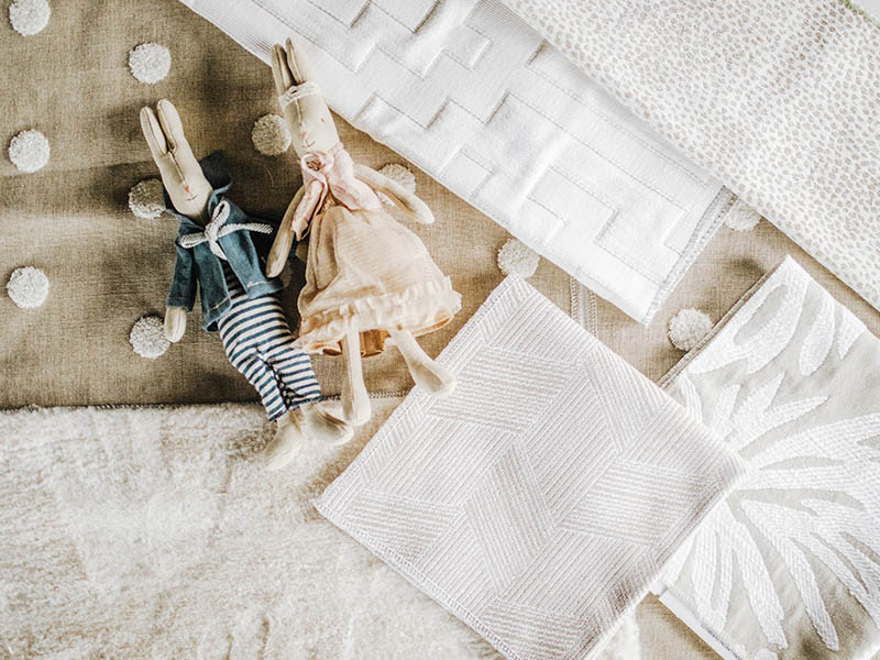
Back Dot – Puff Dotty Linen NH ($34yd), Spotted Animal – Siamese Dove CRL ($126yd), Palm Print – Botanica CRL( $142), Fur – Furocious Natural CRL ($117), Diagonal Natural – Maddox Thibaut ($133), White Geometric – Maize Artic CRL ($128)
Call the shop for more info and to order
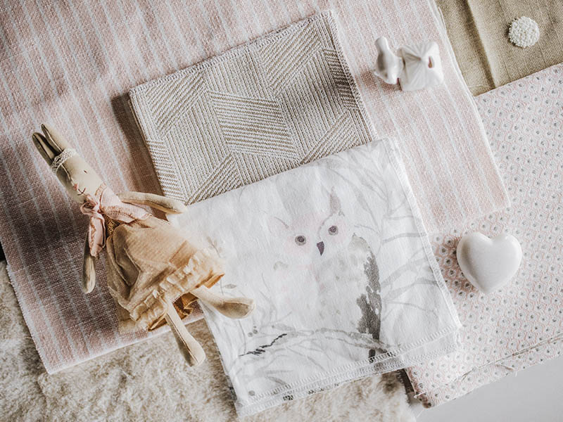
Owl – Strix NH ($54), Pink and Gray Dot- Pixie Thibaut ($152), Pink Stripe – Bayside Strip Blush Thibuat ($110)
Call shop for more info and to order
Since I can’t get enough fabulous fabrics (and in the spirit of the last few weeks of our 20% off upholstery sale) I, of course, have even more pretty pairings lined up to share with you in Part Two next week. With upcoming looks that range from Wild Botanical to what I can only describe as “Grandmillenial Color Pop”, naming these mixes is almost as fun as getting to create them in the first place. I find so much inspiration walking through our fabric rooms and checking out the projects on which our designers are working. I’m always stumbling across fabrics combinations that I’ve never seen before! Next time you are in the shop, pop upstairs and take a look yourself – it’s always something new to discover. Until next time – happy decorating!
