We are back at it with some of our favorite fabric pairings (part two)! Textiles are an essential part of any home; without them a room feels lifeless. You can have all the wall coverings and furniture in the world but without the texture and specific style that comes with fabric, your space will fall flat. Fabric simply provides ambiance and character to your space that cannot be achieved any other way! Us New Traditionalists know that adding textiles to your home can be done in so many ways, from upholstered furniture pieces and pillows, to window treatments, to tablecloths and beyond – there is no limit on rooms that can benefit from a medley of material.
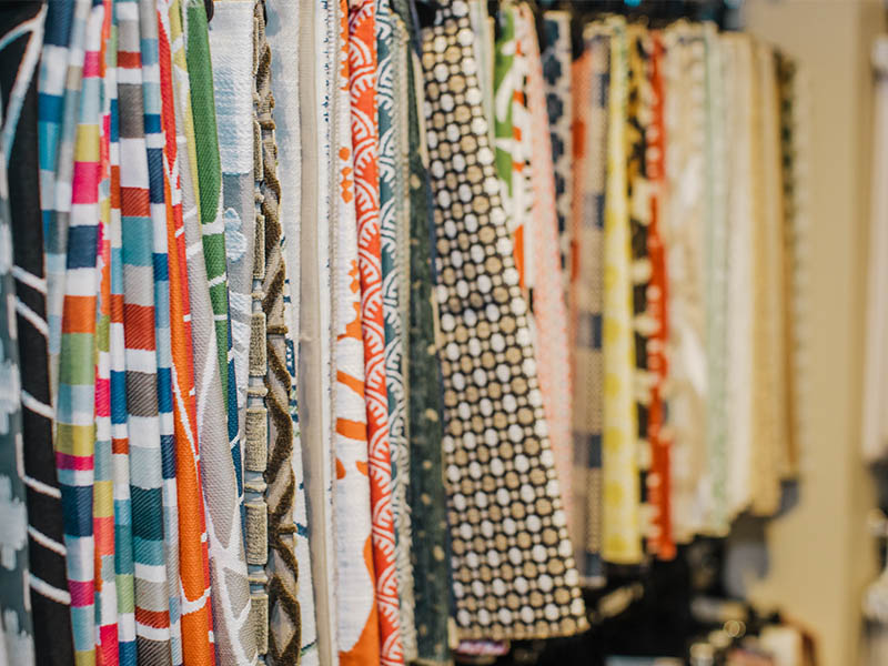
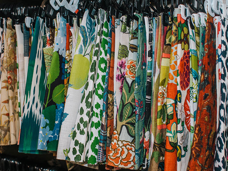
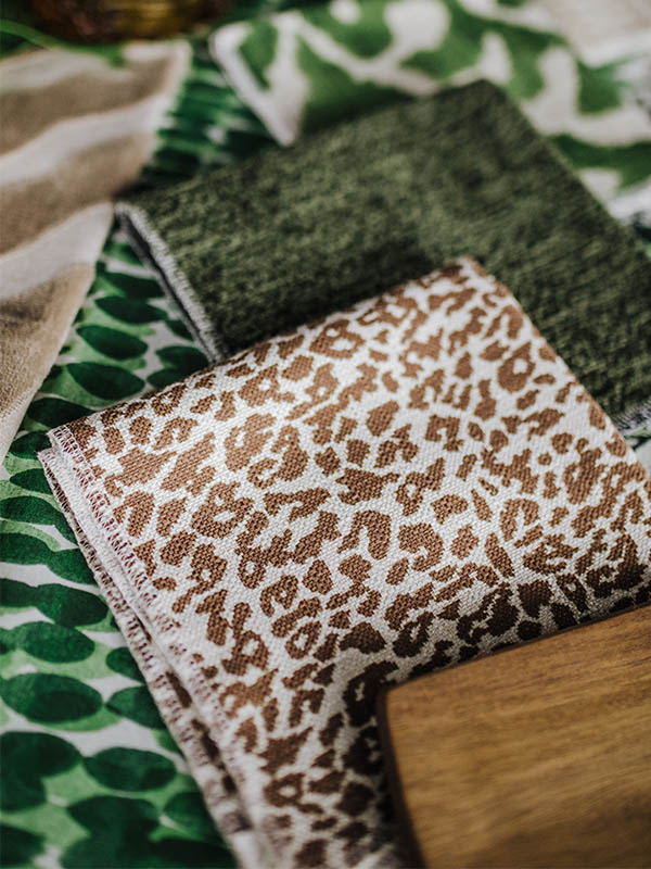
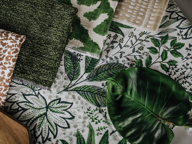
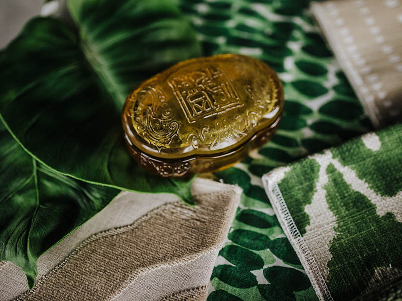
Wild Botanical. This lush and bold look is all about balance. When introducing daring patterns and textures in the same look, it can quickly go from maximalist chic to loud mess. The key is adding simple linens and muted, warm neutrals to the mix. If I asked you to try and pick out what you consider to be the boldest fabric in this group, you might have trouble. Is your eye drawn to the busy colors in the green dotted Rain Water Thibaut? Or perhaps your eye is caught by the deep velvet grooves of the zebra-inspired Etosha Velvet before being distracted by the intricate embroidered beauty of our new Amazonia botanical (and that’s not even taking into account the animal print!). Yet all these power players in the world of fabric work well together thanks to the balance between color and texture. What could easily be an overwhelming pairing becomes a tranquil jungle of deep greens and warm tan hues that calm your eye despite the breadth of patterns. This grouping can be enhanced further with natural elements such as leafy greenery, amber glass, medium wood shades and rattan or leather accents. Remember, a little goes a long way when adding decorative accents to this powerful punch of textiles!
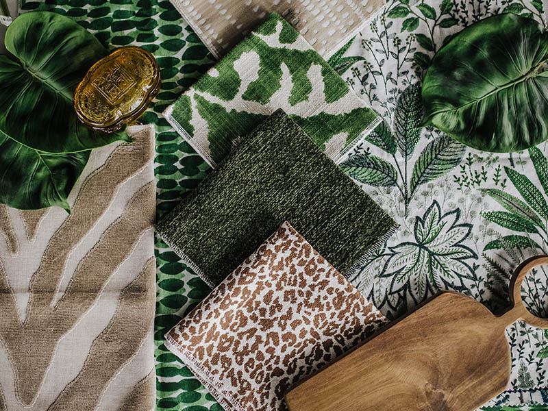
Green Dots – Rain Water Thibaut ($150), Left “Zebra” Pattern – Etosha Velvet Thibaut ($165), Back Embroidered Floral – Amazonia Fern NH ($63), Green and White Pattern – Runy NH ($35), Dark Green Solid – Raffy NH ($38.50), Leopard Print – Iconic Leopard Schumacher (special order call for details), Top Tan Dots – Duma Diamond Schumacher ($121)
Call shop for more info and to order
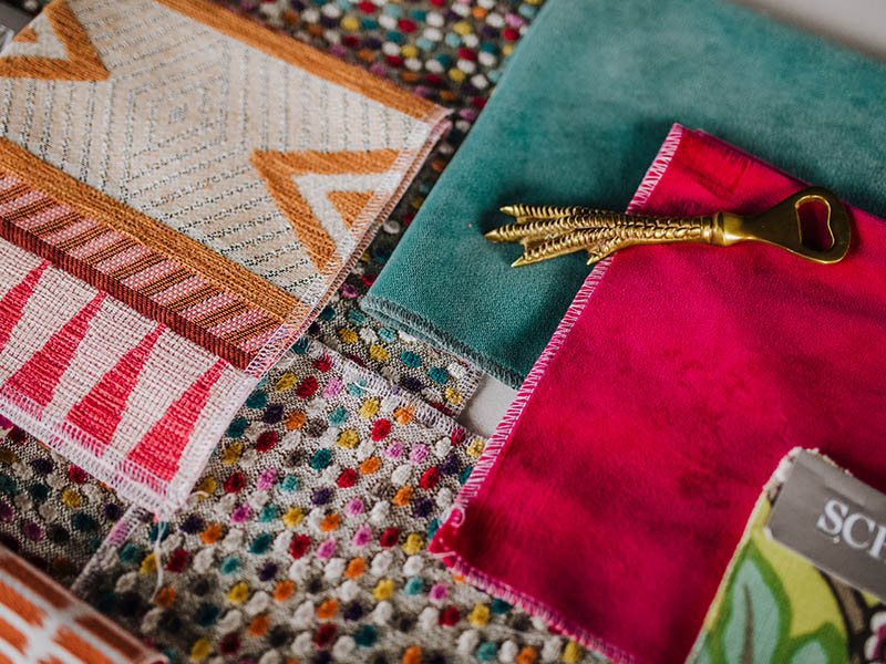
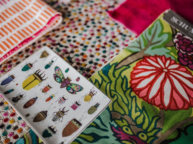
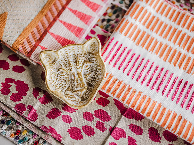
Grandmillenial Color Pop. How I love that Grandmillenial is having its own design movement right now! After my blog post a few weeks back exploring this take on New Traditional design (more on that here) I needed to give myself a creative outlet for the rainbow of designs dancing around my head, and therefore Grandmillenial Color Pop was born! I knew I wanted to create a scene that was youthful, whimsical, and hot pink – which is a bit out of my usual comfort zone! It just goes to show that sometimes the most fun is right outside of “comfortable”. I started off with the spotted energy of our Funfetti fabric (which truly is as sweet as cake) to introduce all of the wonderful hues I’d been itching to explore. The best part is that for all of its color and wonder, it still has a neutral tan base that keeps the look grounded and accessible. There are so many directions to take this look once you get started. I found myself playing in almost two different directions, one being the geometric prints like the pink and orange Adamina Fiesta and Thibaut stripes, and the other leaning towards a new take on wild with the Chiang Mai Dragon and Iconic Leopard Pink fabrics. Now this look takes adventure to the next level and I can certainly appreciate that it isn’t for everyone! However, each of these vibrant patterns can be used as a statement fabric and tied down with swaths of richly colored velvet and simple décor like Sisal natural fiber rugs for a room that has all the excitement that Grandmillenial design is all about!
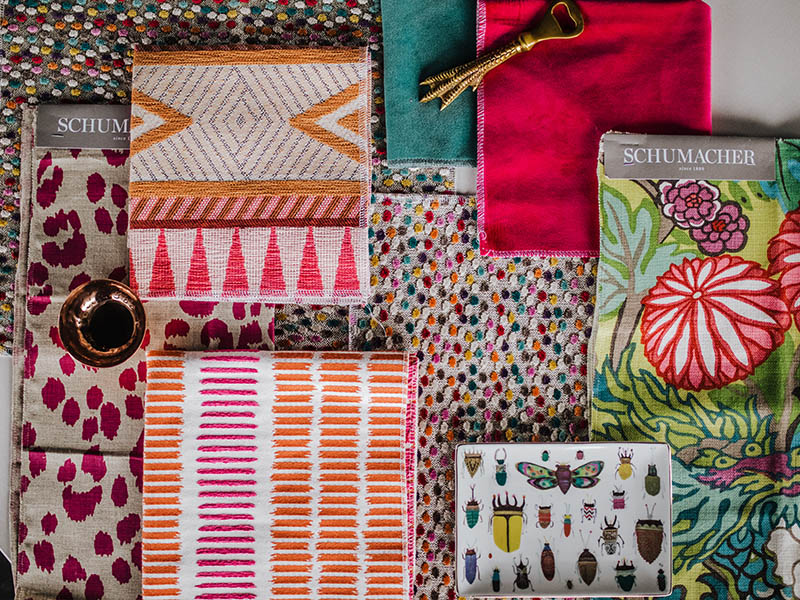
Back Multi Colored Dots – Funfetti Cake NH ($67.50), Pink & Green Velvets – Liberty Velvet NH ($13.50)), Tribal Orange & Pink Pattern – Adamina Fiesta NH ($40.50), Pink Leopard – Iconic Leopard Schumacher (Special Order – call shop), Floral Print – CHIANG MAI DRAGON Schumacher (Special Order – call shop), Orange & Pink Stripe Thibaut ($152)
Call shop for more info and to order
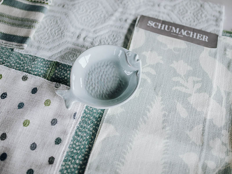
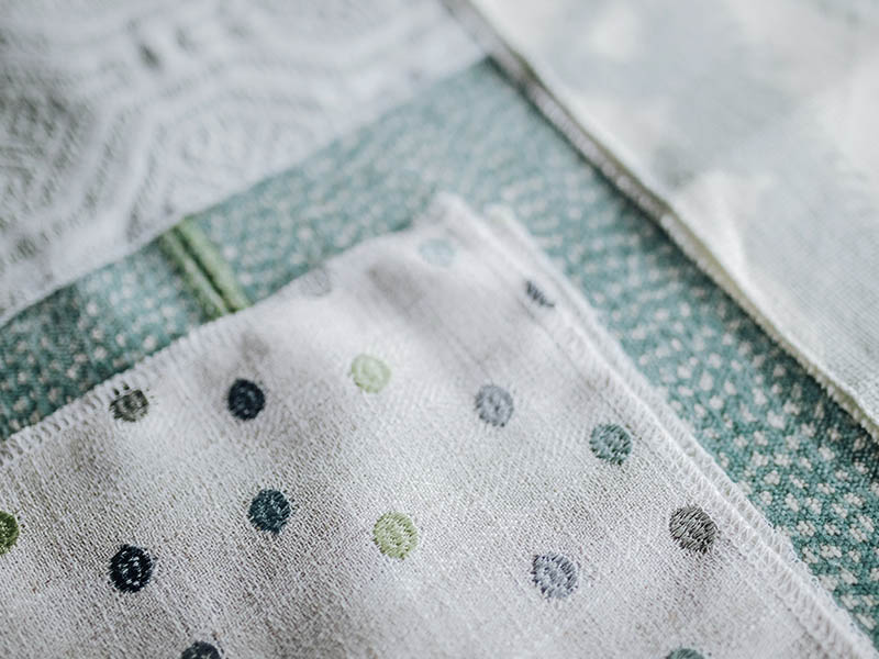
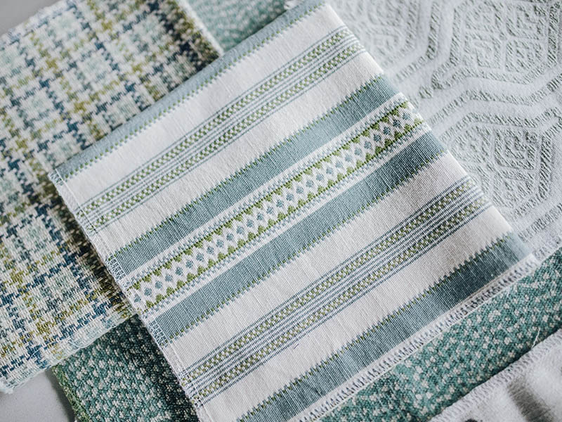
Teal Dreams. The third look in our group this week takes a turn to the serene for a focus on tonality and tint. I utilized teal tones with varying amounts of gray to create a soft look that uses color as a neutral. How can blue (or any color for that matter) be a neutral – isn’t that a contradiction? A little! The answer is that a single color can be used as a base for a room, especially when the hue is toned down with a true neutral like gray. Think of your favorite pair of blue jeans and how many different colors and materials you can mix into a stunning outfit! The same goes for decorating your space – using this approach can open the door to mixing more patterns than ever, especially in a monochromatic color scheme. In this look alone we have polka dots, plaids, stripes, and so much more. Compare this to the similar mix of patterns in our Color Pop look and see the difference! I love how two-tone fabrics like the large print mint and white pattern or aquamarine Schumacher design can really showcase your room. Wouldn’t either make the most gorgeous curtains? This calming and refreshing mix is juvenile enough for a child’s room but can quickly take a sophisticated turn to create the perfect adult oasis. It offers a versatile canvas for furniture – mix this delicate and demure palette with black wood pieces for great contrast, or opt for white or soft, light neutral finishes for a more seamless, “low-volume” look.
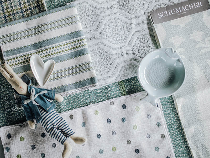
Front Dot – Polka NH ($39.50), Stripe – Alpine Stripe NH ($29), Top Right – Mint & White print NH ($43), Back Green Dot – Siamese Seamist CRL ($126), Right bottom print – Chenonceau Aquamarine Schumacher ($118), Plaid Top Left – Chantham plaid NH ($34)
Call shop for more info and to purchase
Getting to revisit these fun layouts has been a joy and gives me the itch to keep creating! Do you have a direction you’d like to see or a room you are wanting to revamp? I’d love to hear from you on colors or themes for which you would like to see groupings created! As fall approaches, I think it would be fun to take your inspiration to make a special part three that explores looks for your home as well. Write to me in the comments, on social media, or to info@nellhills.com with your ideas! Until next time – happy decorating!

