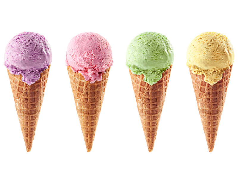
Summertime is near and with that all the beautiful colors that accompany the season. Summertime brings to mind cooling blue-green lake water, the soft moody lighting of a gentle evening sunset and the dewy fresh greens of a well-watered lawn. The plethora of new bright colors this season reminds me of being outside in my childhood and hearing the familiar tune of the ice truck ice cream truck meandering down my street, wondering what colorful concoction would soon be my sweet treat (it was usually something with gumball eyes). Now in adulthood, my sweet treats come in the form of self-care and beautiful décor (and also still ice cream, because treat yourself!). Ice cream hues are vibrant but still soft. They are creamy versions of the fundamental shades we know and love that blend beautifully in your home. Some of my favorites this year are blushing strawberry pink, fresh mint green, delicious light lavender, and tart lemon sherbet. Delicious!
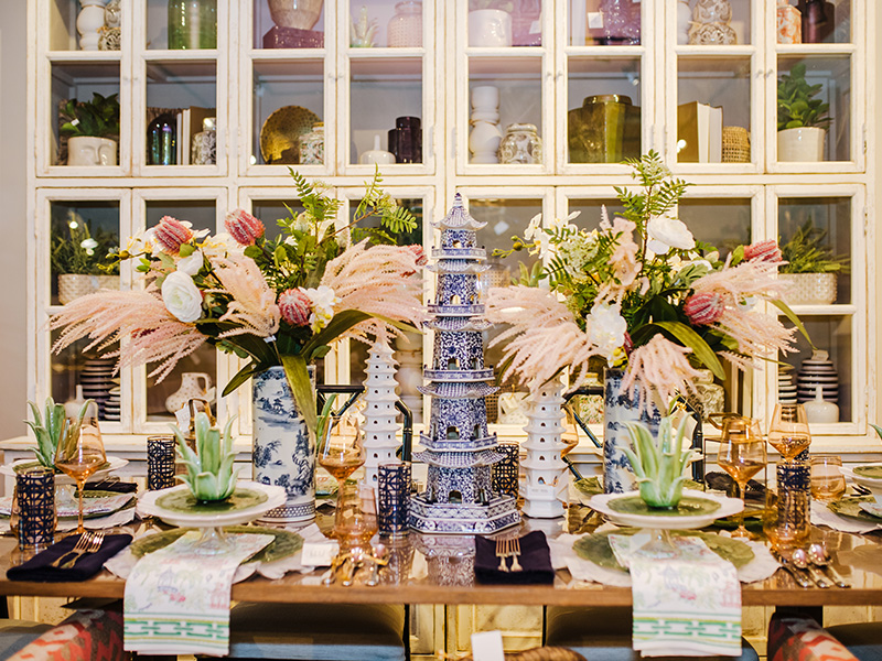
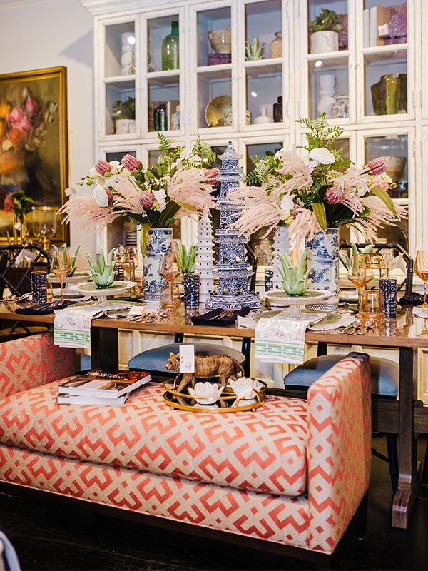
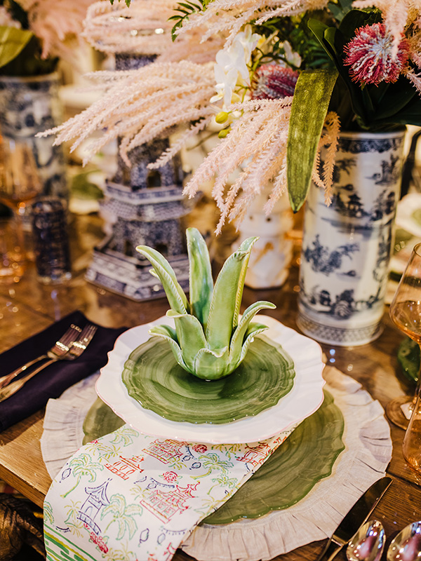
Strawberry Blush. As you could probably tell from my recent blog post on our Prairie Rose paint color, I adore pink! Pink is especially lovely in the home during these warm months – they call it rosé season for a reason! From neutral strawberry blush to magenta, there is no shortage of joy that this color palette can bring. Pink is a delicate color that is sweet and nice, romantic and charming, but can also make a big statement in your spaces. There are plenty of opportunities to incorporate pink into your home, for example we have been adding blush tones to our neutral wheat stem arrangements for a fun and flirty touch.
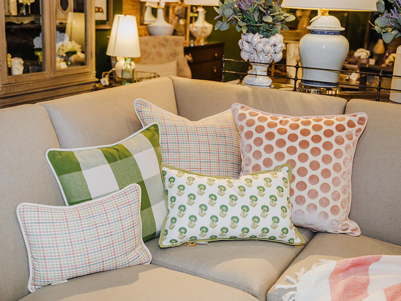
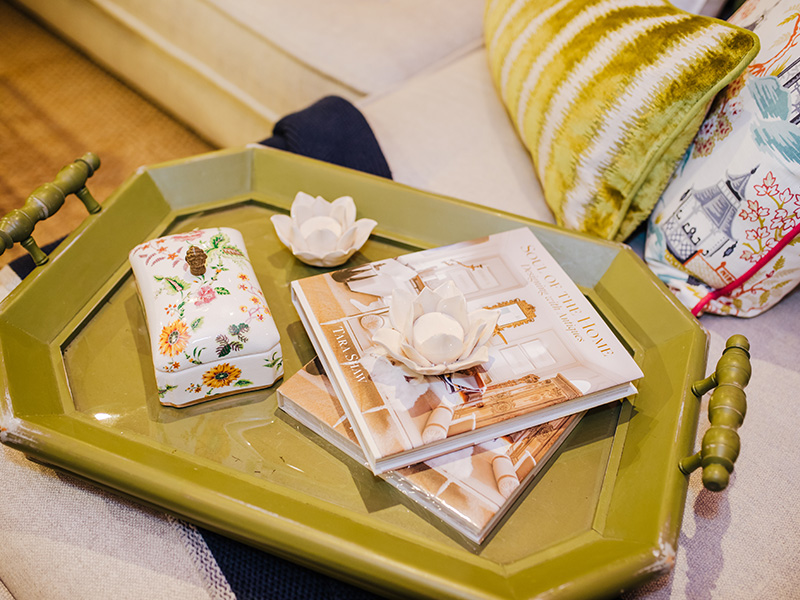
Fresh Mint. Minty green is the perfect pair to summer’s vibrant, sunny colors. With its fresh, icy tones, it can bring refreshing lightness to a room without sacrificing any of the cheer. I love pairing this hue with shades of ever-lovely pink, bright and warm cream colors, and even soothing lavender. We bring green into our rooms with lovely, patterned pillows and plenty of gorgeous accessories.
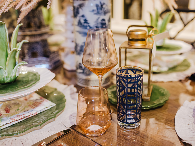
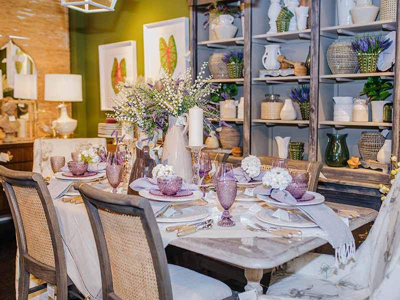
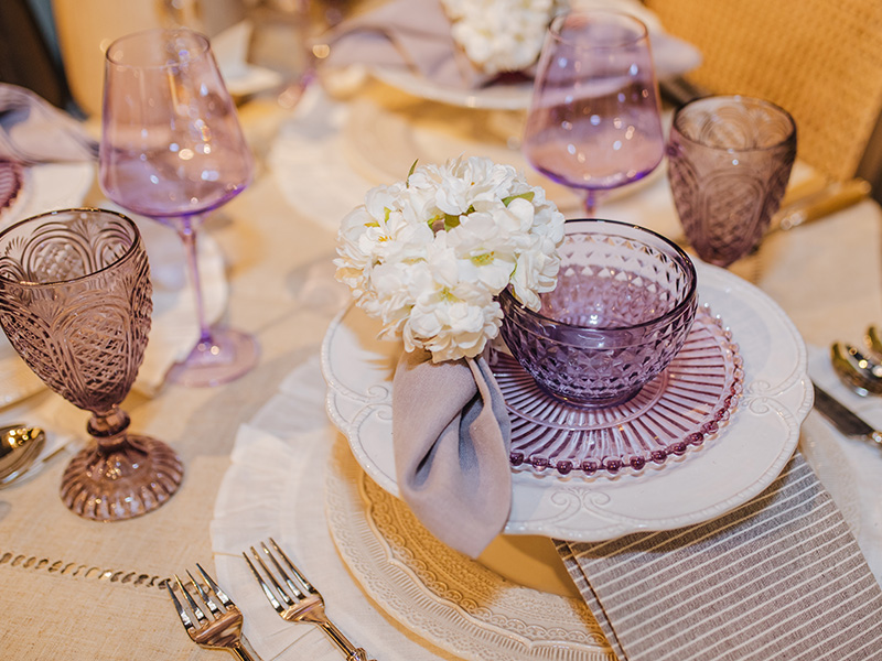
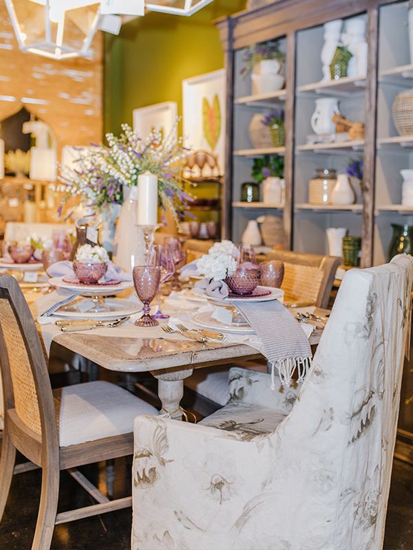
Light Lavender. Purple is not a color we typically have a lot of in the shop, but this season is the exception! We found some lovely lavender hues to bring life to our tabletops this summer. One of my favorite lavender items we have this year are our purple-colored glass. They bring a surprising youthfulness to the space, considering that colored glass is somewhat of a vintage look! I think the brightness behind the glass is what keeps the look whimsical and exciting.
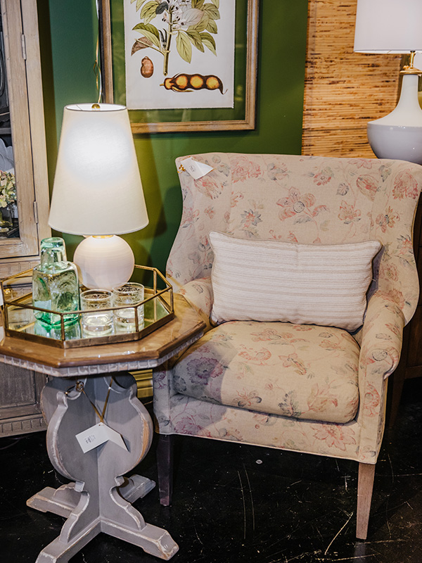
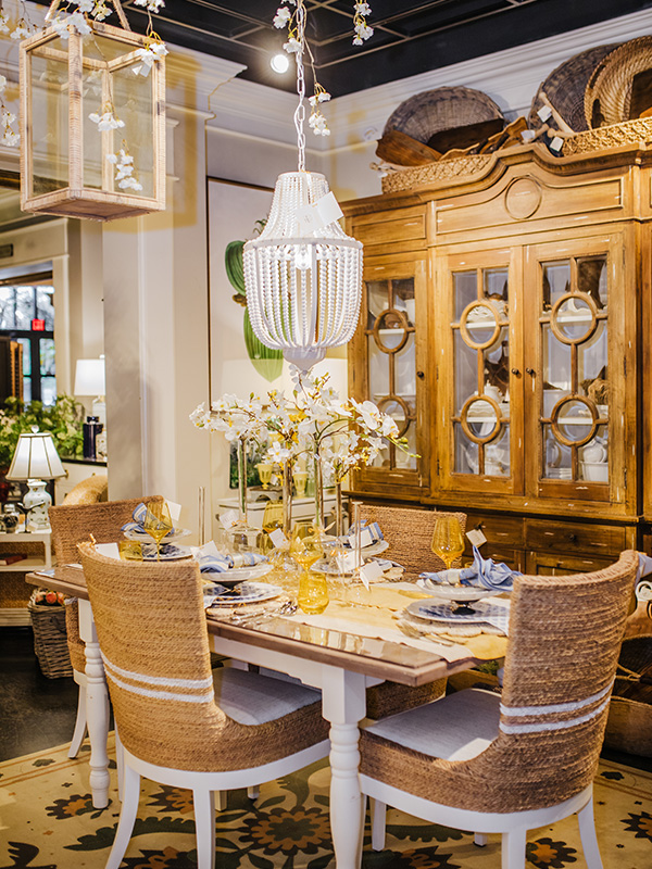
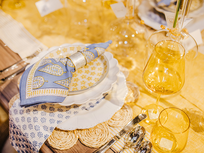
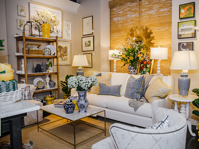
Tart Lemon. We can’t talk about the colors of summer without mentioning yellow! Yellow will be sticking around for most of 2021 as Pantone’s color of the year, but summer is the perfect time to perfect your bright and sunny home additions. I love mixing this sharp shade with blues for a flair that can either go French country chic or lovely lake house without a fuss! All my current favorite floral fabrics are bursting with pops of this lovely hue.
Summer is such a fun time for décor, and I can’t wait to decorate with all the colors of the season. There are plenty more trends and colors coming up as we approach this next phase of the year so stay tuned for a look at lovely French blue, earthy neutrals and so much more! Also be sure to join us at our upcoming Summer Open House April 30 – May 2 to see all these trends in person! Until next time – happy decorating!
