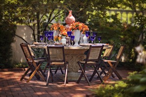
Orange you glad orange is back in style? Some of you are nodding your heads vigorously because this friendly, high octane color gives you the energy kick you’re longing for in your home décor. Others of you are shaking your heads just as vigorously, possibly having a flashback to your ‘70s kitchen plastered in sunset, harvest gold and avocado.
When Pantone declared Tangerine Tango as the color of the year last year, a lot of people were skeptical. But at Nell Hill’s, we have had a blast working this life-giving color into traditional and contemporary home design, whether it’s a drop for drama or a space saturated in one of orange’s many provocative shades. Many of our customers are loving it, too. And as autumn approaches, orange is going to play an even more important part of seasonal décor.
Wanna play with orange? Here are three ways you can add a little – or a lot—to your home’s decor.
1. Add a Splash of Paint
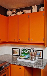
When I think of orange, I think of Rich, one of our interior designers at Nell Hill’s. No one does this daring color better than Rich. He had the courage to paint the cabinets in his kitchen orange, and his risk paid off – the space is simply splendid. So I asked Rich to join me in giving some pointers on how to, and not to, use this showy color.
Just like Rich did, a fun way to pull orange into your décor is through paint. The good news is, orange comes in such a huge array of tones, you can find one that enhances your home’s style, whether it’s super traditional or contemporary.
I was thinking of traditional homes like mine when I added Persimmon to my line of Mary Carol Artisan Paints. This terra cotta tone looks beautiful with autumnal colors like sage green, chestnut brown, amber and cream. At Nell Hill’s, we’re also pairing Persimmon with charcoal gray, and as Rich says, “It takes it to a whole new level.”
If your look is more contemporary, experiment with a bright orange paint, maybe on one wall to start with. Rich advises pairing it with a quiet neutral, like Garrity Cream, to add some much-needed balance to the space. If you aren’t a fan of citrus toned oranges, he suggests more pinkish tones, like our Peony, a peppy coral. Peach is a great option if you like quiet pastels.
Before you get out the drop cloth and painter’s tape, test your paint on the wall, Rich cautions. “As bright at the color seems on the paint chip, it will be amplified by 100 percent when you put it on all the walls,” he says. He advises buying a quart, covering a few poster boards to hang on your walls to see how the color translates in your space.
2. Find Some Fabulous Fabrics
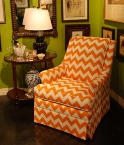
Feeling feisty? Me too. That’s why I have fallen for orange mixed with bold graphics and reinvented furniture silhouettes. When you’re decorating with strong colors and patterns like these, be sure to balance them out with solids and quieter tones to keep the room from taking on a circus atmosphere, Rich cautions.
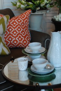
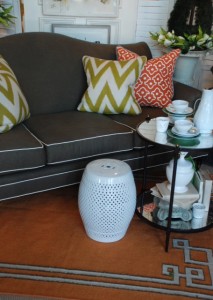
My home is very traditional, so the chair like the one above would feel out of place. So I’m bringing in patterns like chevron stripes and Ikats through my pillows. This playful pillow combination is on a decidedly traditional gray sofa with a cream welt. It’s a great example of how you can add a splash of today’s colors and patterns to keep traditional décor from feeling stale. I’ve done it in my home and am crazy about the results.
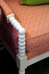
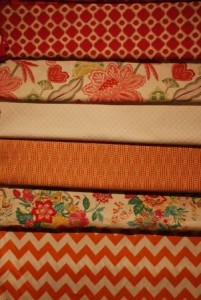
Orange tones used in upholstery fabrics are spanning the spectrum from rust to coral. Rich likes the preppy Palm Beach colors: tangerine, fuchsia and kelly green.
If you want a hip, progressive look in your space, Rich recommends covering a sofa or dining chairs in orange linen, then painting your walls white or cream.
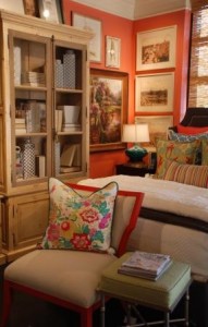
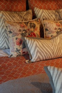
If you like a more traditional color palette, go for a browner shade of orange, like rust, and pair it with camel, green and gray. “It gives you that dignified, country house feel but with a newer twist,” Rich says. The custom bedding ensemble above mixes a warmer orange with soft floral and animal print accents for a transitional look we love.
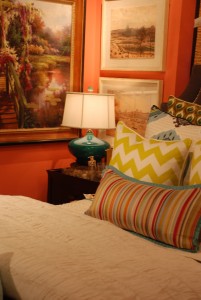
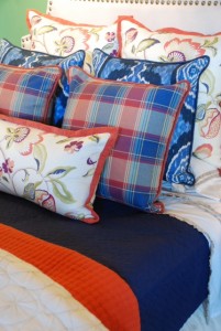
Check out the sensational combination above. Complementary colors orange and blue are made to go together.
3. Add Arresting Accents
Artwork and Pottery
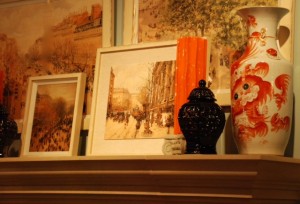
The photo above from Nell Hill’s Briarcliff shows how lovely orange looks in a more traditional display. In my home, I have touches of orange everywhere, but it’s almost all through artwork and accents. The layers of artwork resting on the side of the mantel do a beautiful job of celebrating orange. The dragon jar on the right echoes the color and style. The addition of the contemporary pottery pieces makes the whole scene fresh.
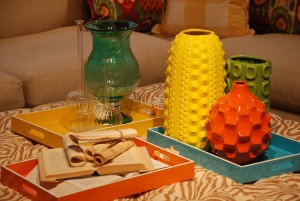
If you want to experiment with orange, or you just want to enjoy this strong color for a season or two, Rich suggests you add little punches through inexpensive accents, like the pottery and tray pictured above.
Area Rugs
In previous blogs I’ve sung the praises of flat weave rugs, my new darling in flooring. We’re carrying several in orange at Nell Hill’s because we love how they zip up a room.
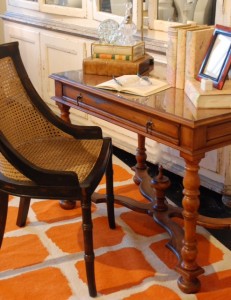
Who says old and new can’t live side by side together? The photo above from Nell Hill’s Briarcliff shows how beautiful these two styles blend. The orange area rug is refreshing next to this very traditional desk.
Lighting
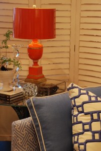
Another super easy way to tap into strong colors like orange is to work them in through lamps. I’ve gone ape over the fabulous new styles I’ve seen at market of late, which bring in bold colors in sleek but traditional designs.
Next Week … Two of my favorite tools for fall decorating are lanterns and orbs. Next week, I’ll share some suggestions (and lots of eye candy) for decorating with lanterns. I’ll blog about orbs the following week.
