Colors We’re Loving in the Shop Right Now
As new items have been hitting the floor, I’ve started to notice a few color stories that are taking shape. Color plays a strong role in the shop, and a few palettes keep showing up — gentle greens, classic blues, grounding neutrals, and bold accents. Each one brings its own personality, and each one feels just as at home in a styled vignette here as it does in a lived‑in space. Here’s a closer look at the colors we’re reaching for right now.
Seafoam + Pastel Ocean Greens
Soft seafoam and pastel ocean greens are all over the shop right now and they’re the perfect color to carry us from the first warm days of early summer straight into the long, hot stretch ahead. There’s something cooling about them – almost like shade on a porch or a quiet morning before the heat settles in. In the shop, they’re softening shelves and tabletops; in a home they’ll do the same and bring a gentle, calm feeling to your space. They work beautifully with natural textures and light woods, and they’re the kind of colors that makes a room feel relaxed without losing structure. Whether it’s a lamp, jar, bed, or a patterned pillow, these soft greens and blues settle into a space in a way that feels effortlessly chic.


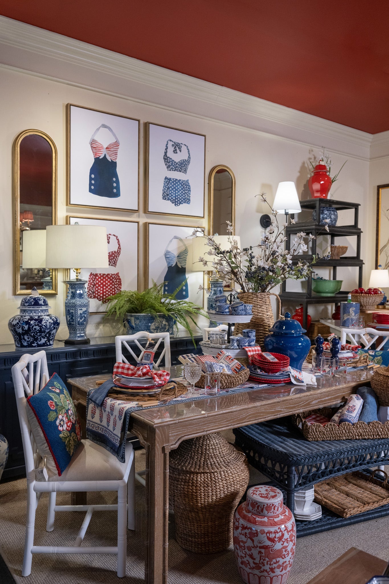
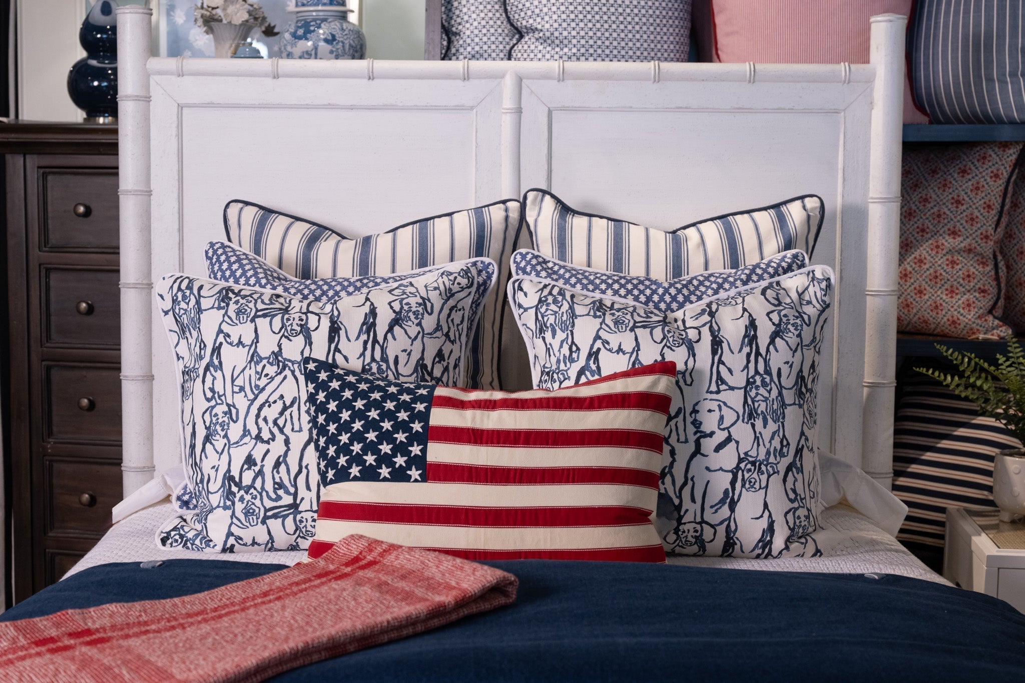
Royal Blue Accents
Royal blue is showing up in a way that feels classic and confident. It’s woven through stripes, florals, upholstery, and those crisp blue‑and‑white pieces we always love. Not only does royal blue anchor soft palettes but it adds intention and sophistication to a room. As an accent, it adds structure, and if drenched, it creates a space that feels tailored and timeless. It’s the color we reach for again and again when a space needs something strong but still refined.


Warm Neutrals: Browns + Beiges
Warm neutrals are playing an important supporting role right now, especially the ones with depth. They’re subtle, steady, and grounding and are the kind of tones that make everything around them feel more balanced. We love a warm neutral because they keep a space from feeling too sweet or bright yet add a sense of warmth, depth, and texture to keep things interesting. They act as a backdrop to let colors shine and they’re easy to live with, layer, and adjust for the seasons.


Pops of Bright Reds + Oranges
There are bountiful of pops of bright reds and oranges throughout the shop and they are bringing the energy! They’re cheerful without being loud, and they pair beautifully with greens, blues, and neutrals. You’ll see them in florals, pillows, lacquered boxes, bar carts, artwork, and small decorative pieces that instantly wake up a room. When used thoughtfully, these shades add personality and a little spark — the kind of touch that makes a space feel lived-in and joyful.


Across the shop, we’re layering these colors in ways that feel effortless. Soft greens are mixing with woven textures. Royal blue is grounding lighter upholstery. Warm neutrals are adding depth and balance. And those bright reds and oranges are appearing in small, intentional ways that lift the whole room. It’s all about letting each palette play its part and creating combinations that feel relaxed and inviting.
The shop feels especially vibrant right now, and these palettes are a big part of that. If you’re looking to refresh a room, or to gather inspiration, it’s the perfect time to stop by and see what’s new. Until next time – Happy Decorating!