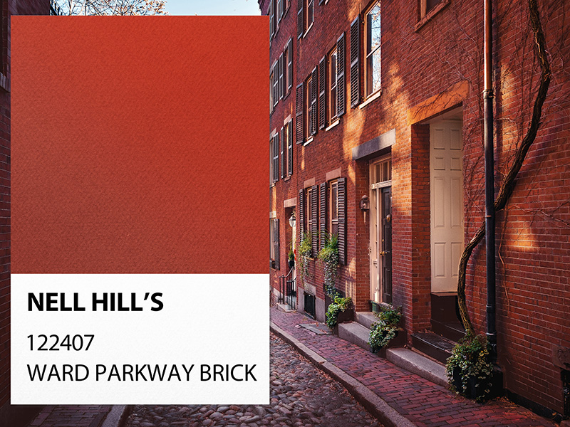
The language of color is complex and can be different for each person. The way we view and relate to color is influenced by our experiences. Creating our paint line has been an exciting challenge that has required me to dig deep into what color means to me and what it can bring to the world of home design. One of our wildest shades brings to the forefront passion, love, activity, heat, and joy – yes, the color is red and it is not for the weak at heart! However, that is perfect since I’m not one to play it safe when it comes to design! After searching through so many different shades that I was almost seeing red (hehe) I found the perfect dominating red tone – Ward Parkway Brick.
Bold, brilliant, and full of energy – this deep, traditional red is a color power move for those who like it bright yet sophisticated. I love using this color in entry halls to add warmth and depth to furnishings and paintings or as a statement wall or ceiling to add a pop of the unexpected. I’ve currently got this beautiful shade on my dining room ceiling, and it is stunning!
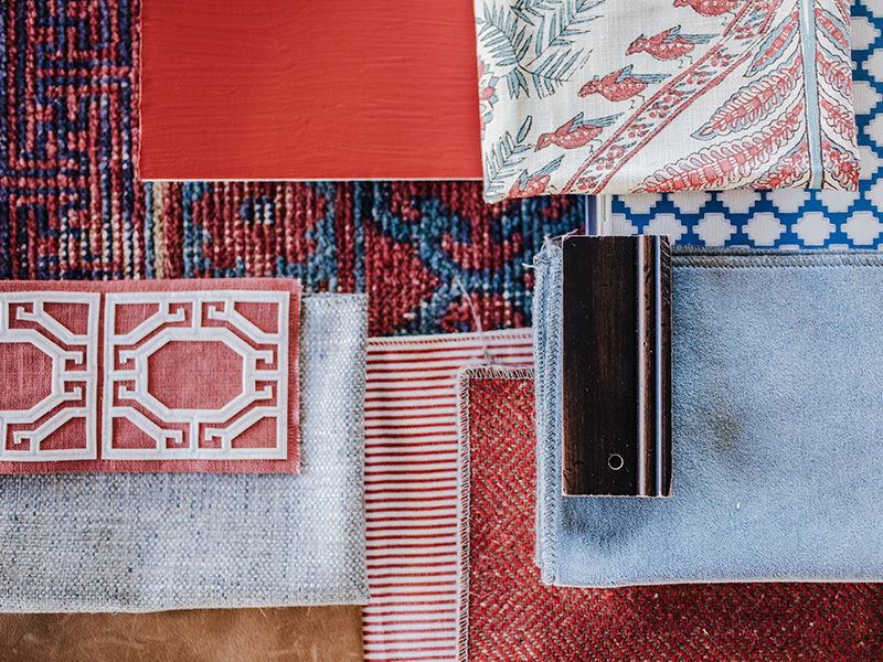
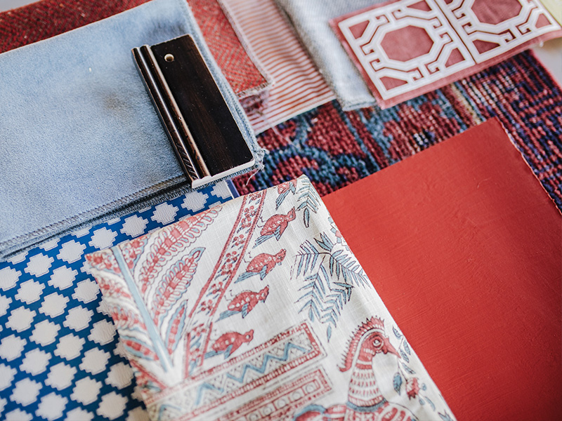
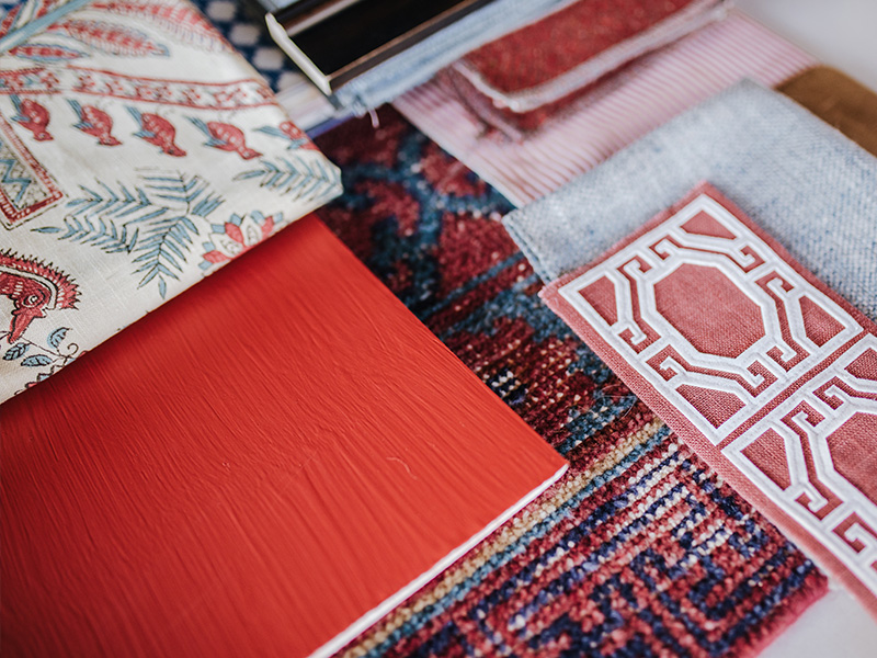
With Memorial Day around the corner and our most patriotic holiday soon to follow, our designers had some fun bringing a new spin to red, white and blue with this fun paint color. Starting us off, Anne Epstein went for a traditional color palette with clear blue tones and classic red accents to compliment the bright hues of Ward Parkway Brick. Her gorgeous living room vision features two skirted sofas in soft denim with stunning Schumacher red trim paired with red herringbone chairs and bold striped stools for a look that is as bold and full of energy as the paint color itself. Tying her room together is a simply mouthwatering blue and red rug of which I can’t get enough!
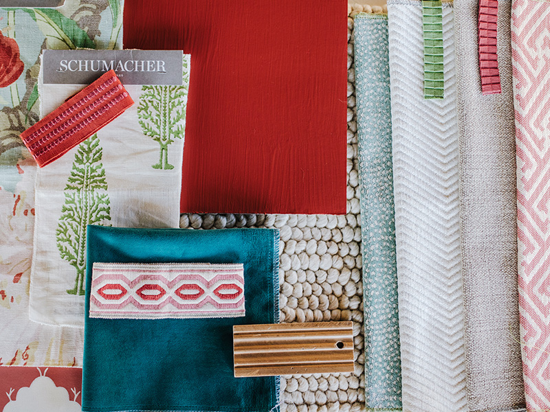
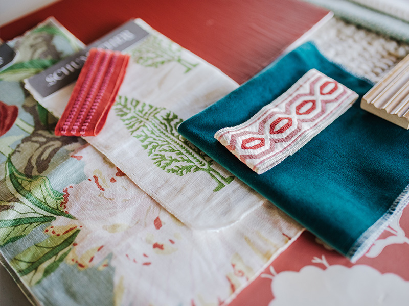
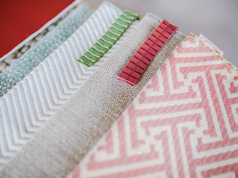
Designer Kimberly Martin took a different approach by pulling out the coral undertones of the paint color and introducing fresh green to this traditional color mix. This mixture of textiles is the definition of light, bright and preppy! Tying her design together is the fantastic Schumacher floral print that brings in fresh turquoise and crisp green to play with her many shades of red. This textile would make for a show-stopping statement chair! With fun pops of ruffle trim and delicate animal print, this whimsical, feminine look would make for a lovely living space.
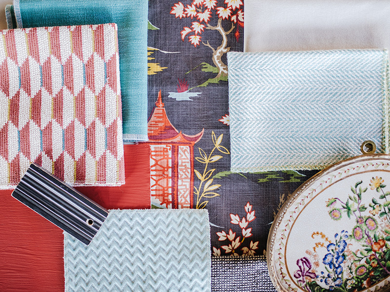
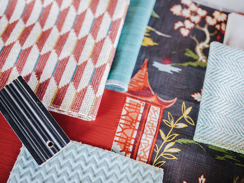
Switching gears to the bedroom, our designer Liz Pohl knows that color is queen. Starting with a duvet in the deep and dark Asian print leaves a lot of room for playful elements to pop around your room. Full of sky blue and navy with a full spectrum of joyful red, there is no limit to where you can take this fabric! Pairing it with a beautiful end of the bed bench in the geometric red is an unexpected pattern mix that adds intrigue and depth to your room. Balance it out with a calming blue herringbone chair and some lightly hued pillows for a well-weighted look.
I can’t wait to see all the designs that are yet to be created for this wonderful red. Visit us online for a look at the rest of our exciting paint colors and let me know which one you would like featured next! Until next time – happy decorating!

